A Fitness Brand Transformed!
Stepz Fitness, an Australian-owned gym franchise operating for over a decade, recently underwent a complete brand transformation with the help of Ideas Marketing. The brand has helped more than 20,000 people across Australia with its traditional 24/7 gym offerings. However, the fitness industry is highly competitive and fast-changing, with customer needs evolving continuously. Therefore, Stepz Fitness sought to differentiate itself from the competition and enhance its customers’ experience.
The next natural move for us is in strengthening our audience ties and playing a bigger role in their lives. It’s about going beyond the ‘body’ and addressing overall wellness. Life is more demanding than ever – we have less time and more expected of us. Yet where there are challenges there are opportunities. Amidst the technological takeover, there remains an overwhelming desire to maintain genuine connection – for vital support where and when people need it. Stepz is in the rightful position to take that role.
Our vision for Stepz Fitness was to create a desirable brand with the market strength to better support wellness. If there’s one thing we knew, the physical presence of Stepz will be very different in 5, 10 even 15 years time. That’s a good thing. It’s this readiness to adapt which will see them maintain relevancy in the hearts and minds of our customers. While Stepz overall purpose shouldn’t change, the way the brand delivers on that should naturally evolve to keep up with ever-changing cultural, category and customer trends.” said Scott Bouquet
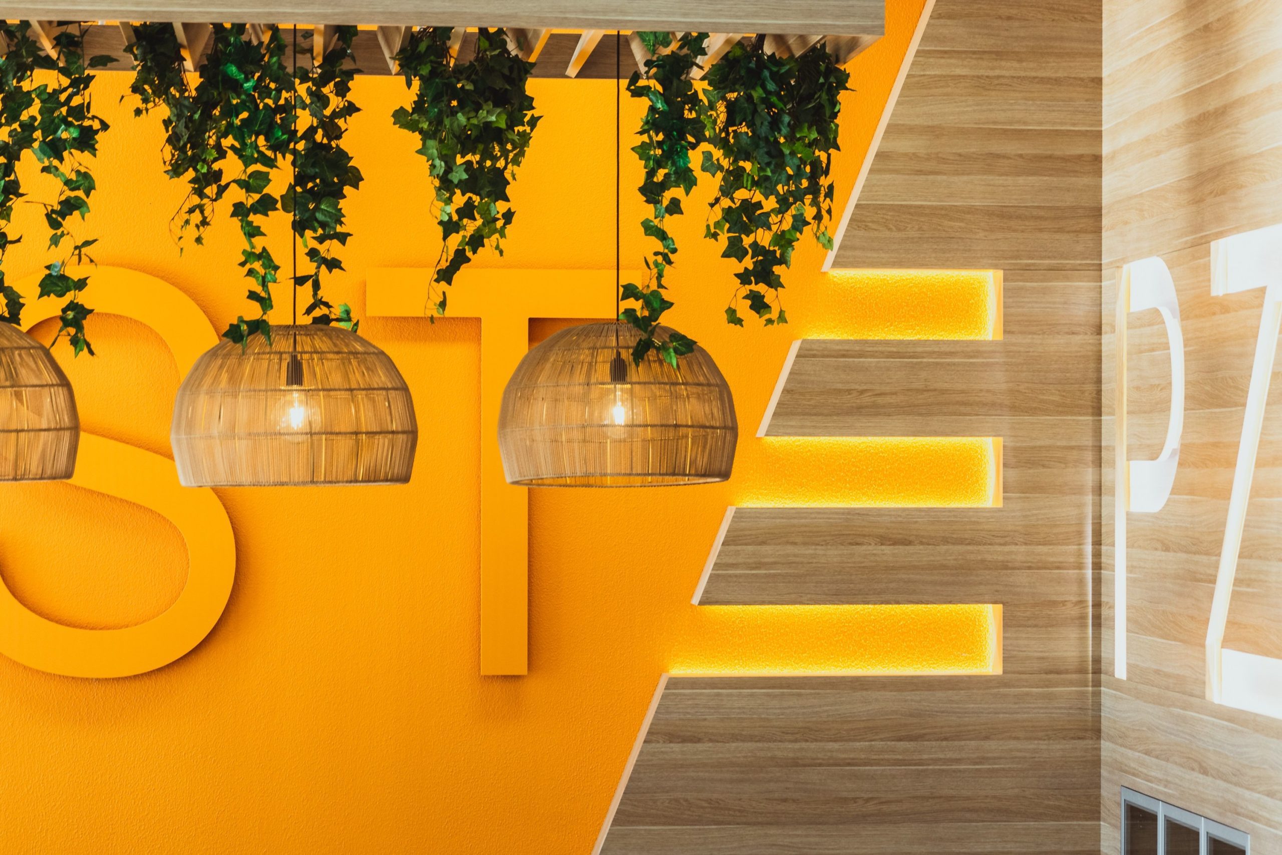
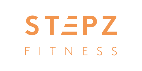
Stepz Fitness is not just a gym franchise, it’s a modern, forward-thinking lifestyle brand. This is apparent in the brand’s commitment to evolution and progression, which is reflected in its innovative brand transformation process. The new logo, which features custom typography and negative space, captures the idea of stepping up and moving forward. The geometric typography and custom lettering create a modern and recognisable brand mark that is both accessible and aspirational, contemporary and personable. The angle of the “E” gives the logo a sporty modern edge, while the soft rounded “P” and “S” combined with a warm pastel orange make the brand feel approachable.
This attention to detail and commitment to innovation is a hallmark of the Stepz Fitness brand. As Scott Bouquet, CMO of Stepz Fitness, notes, “Our vision for Stepz Fitness was to create a desirable brand with the market strength to better support wellness. If there’s one thing we knew, the physical presence of Stepz will be very different in 5, 10 even 15 years time. That’s a good thing. It’s this readiness to adapt which will see them maintain relevancy in the hearts and minds of our customers.”
The branding agency, Ideas Marketing, gave the letter “E” a special treatment, with a sporty, modern angle that reflects the brand’s focus on progression and forward movement. However, it’s important to note that at this stage, the “E” is not established enough to be used on its own as a primary brand mark.
By using the “E” as a unique mark throughout collateral, Stepz Fitness can create a cohesive and consistent visual language that reinforces the brand’s values and personality. Whether used in print materials, social media graphics, or signage, the “E” can serve as a powerful symbol of the brand’s commitment to helping customers progress towards their fitness goals.
The brand launch video and hype reel for Stepz Fitness was a crucial element of the rebranding process. It helped to create excitement and anticipation for the new concept and generate interest in the brand.
The video showcased the new brand identity, using custom typography, bold colours, and graphic elements to bring the brand to life. It also highlighted the unique features of the new concept, such as the holistic approach to wellness and the welcoming interior design.
The hype reel was another powerful tool in building excitement for the new brand. Ahead of the brand launch, the marketing team released a powerful video showcasing sneak peeks of the new look and feel of the gyms, along with testimonials from existing patrons and franchisees. This video played a crucial role in generating excitement and building anticipation for the new concept.
Both the brand launch video and hype reel were instrumental in building hype and generating interest in the new concept. They helped to set Stepz Fitness apart from other fitness brands and established the new brand identity in the minds of customers and franchisees alike.
The success of the rebranding process, which saw the franchise expand and earned recognition from industry experts, owes in part to the power of the brand launch video and hype reel. It played a crucial role in establishing a strong brand identity and generating enthusiasm for the new concept.
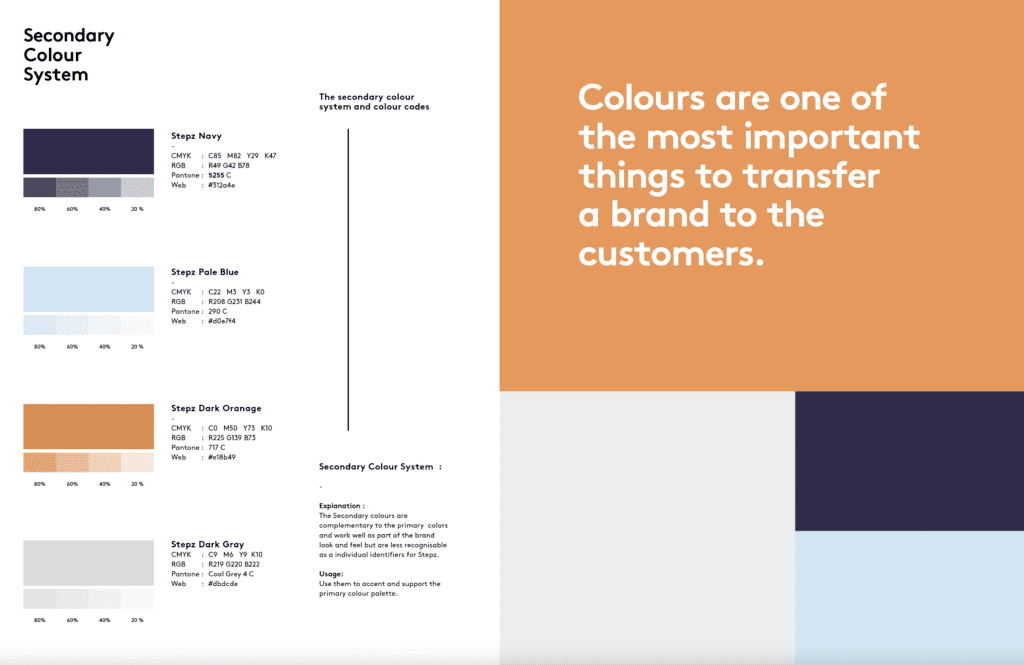
Stepz Fitness has incorporated a dynamic colour palette that is not only visually appealing but also reflects the brand’s personality and values. Along with the vibrant orange, the colour palette includes navy blue and light blue, which complement each other and create a cohesive look and feel.
To enhance its brand image, Stepz Fitness chose navy blue as a primary colour for its rebranding. This timeless classic colour signifies strength, reliability, and trustworthiness, creating a sense of calm and authority. Navy blue is a versatile color often associated with fitness and athletics, making it a perfect fit for the Stepz Fitness brand.
Light blue, on the other hand, symbolises peace, tranquility, and health. It’s a colour that evokes feelings of calmness and relaxation, making it ideal for Stepz Fitness’s wellness-focused concept. The use of light blue in the brand’s colour palette reinforces its commitment to providing a holistic fitness experience that promotes overall well-being.
By incorporating navy blue and light blue with the brand’s signature orange, Stepz Fitness has created a colour palette that is not only visually appealing but also communicates the brand’s values and personality. The use of these colours in branding materials, such as the website, marketing collateral, and gym interiors, helps to create a consistent and recognisable brand identity that sets Stepz Fitness apart in the competitive fitness industry.
The marketing team and interior designers worked closely to strategically use soft, pastel colours and warm lighting to create a welcoming atmosphere and reduce intimidation, while also carefully considering the placement of communal tables near the entry and furniture to encourage socialisation and create a sense of spaciousness within the gym.
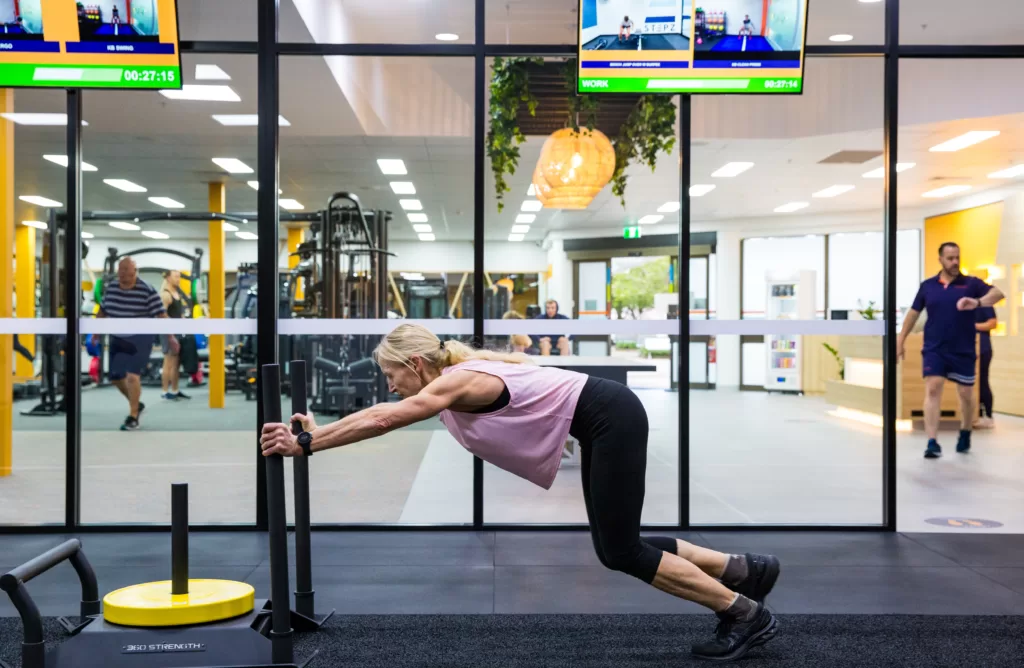

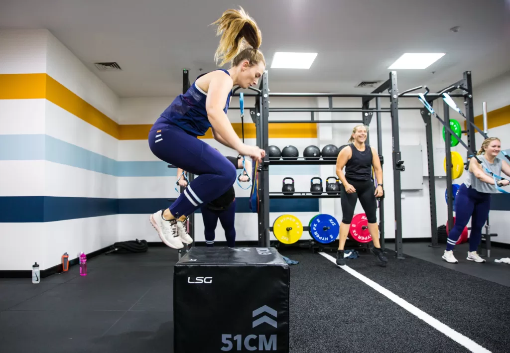
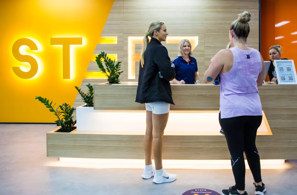
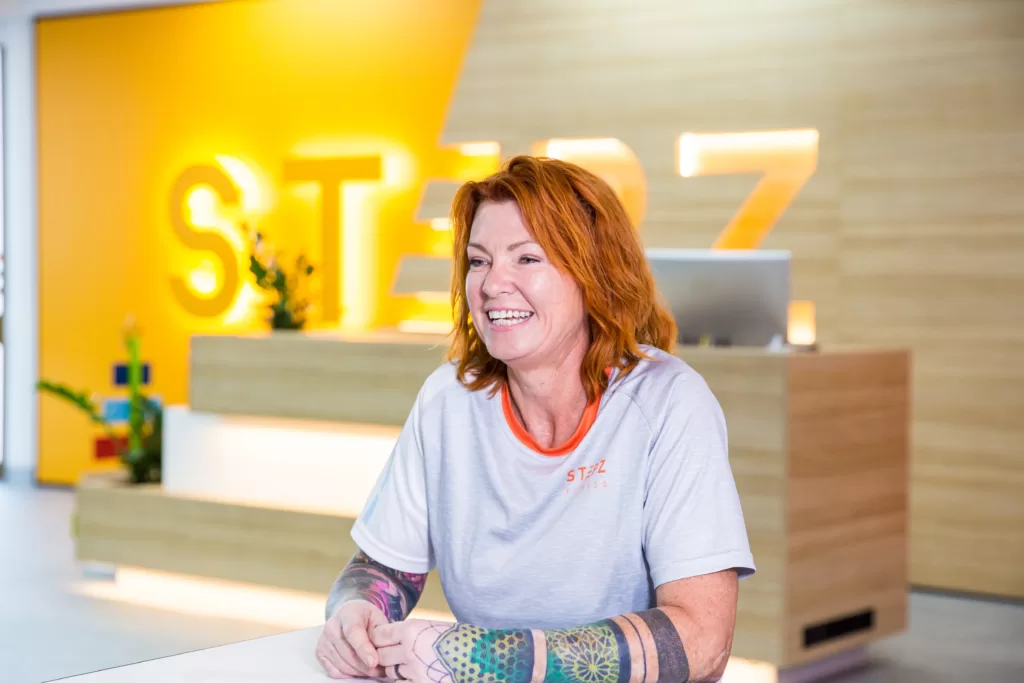
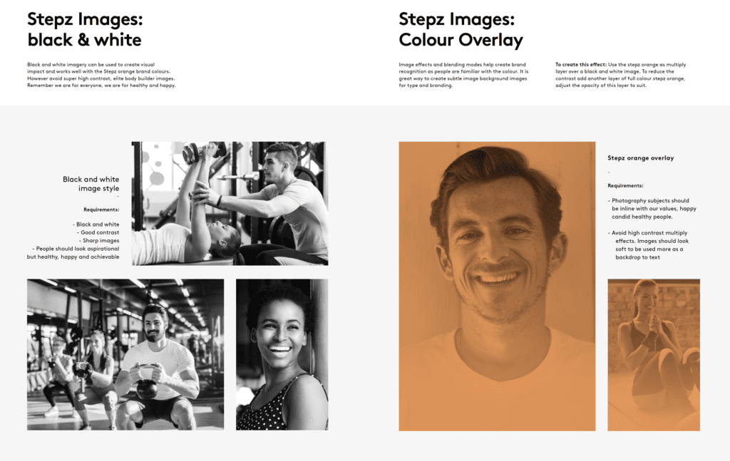
Stepz Fitness has a distinctive photography style that reflects its brand identity. The images are bright, energetic, and convey a sense of motion, highlighting the brand’s focus on movement and progression. The photos often feature individuals of diverse ages, body types, and fitness levels, promoting inclusivity and accessibility.
The use of natural light and outdoor settings, such as parks and beaches, creates a sense of connection to nature and a healthy lifestyle. Additionally, the use of dynamic angles and close-up shots creates a sense of intimacy and engagement with the viewer.
Overall, Stepz Fitness’s photography style is a key element in its branding efforts, and it effectively captures the brand’s values and message.
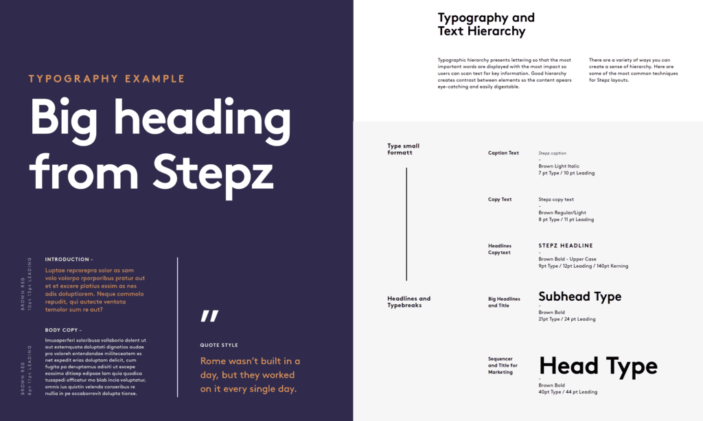
Typographic hierarchy is a fundamental design principle that can greatly impact the readability and overall visual appeal of text. It involves arranging the lettering in a way that highlights the most important words and messages, making it easier for readers to quickly scan and locate key information.
Creating a good typographic hierarchy involves using various techniques such as font size, weight, color, and spacing to establish a visual hierarchy that draws the reader’s attention to the most important elements. The goal is to create contrast between the different elements to make the content more engaging, visually interesting, and easy to understand.
For Stepz Fitness, creating a clear typographic hierarchy was crucial in effectively communicating their brand message and values. Through the careful selection of fonts, colorus, and layouts, Ideas Marketing established a cohesive visual language for Stepz Fitness that effectively conveyed their message and made their content more appealing to their target audience. By utilising typographic hierarchy, the brand was able to create a consistent and engaging experience across all their marketing materials, including their website, print ads, and gym signage.
Stepz Fitness has expanded from nine to 18 locations across New South Wales and Queensland, indicating the success of the rebranding process in revitalising the brand and resonating with customers and franchisees. The rebranding effort was also recognized as a finalist for Franchise of the Year at the Ausfit 2022 national awards, highlighting the hard work and dedication of both the Stepz Fitness team and Ideas Marketing.
Overall, Stepz Fitness’s rebranding strategy demonstrates the power and impact of investing in a complete brand transformation process. The success of the franchise’s expansion and recognition in the industry are a testament to the value a well-executed rebranding strategy can bring to a business.
Author: Scott Bouquet
See the case study Here


This site is not available in landscape mode,
Please turn your mobile.
Bonjour, comment pouvons-nous vous aider ?