Hubspot Services


 Call us now
 1300 643 327


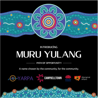
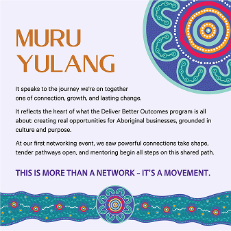
Muru Yulang: A Brand Built to Help Aboriginal Businesses Thrive.
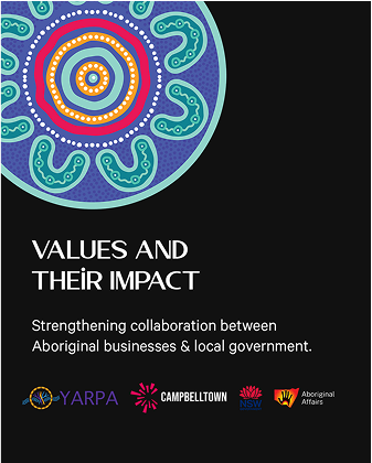
PROJECT PARTNERS.
We’re proud to work alongside our partners to support better outcomes for First Nations people.


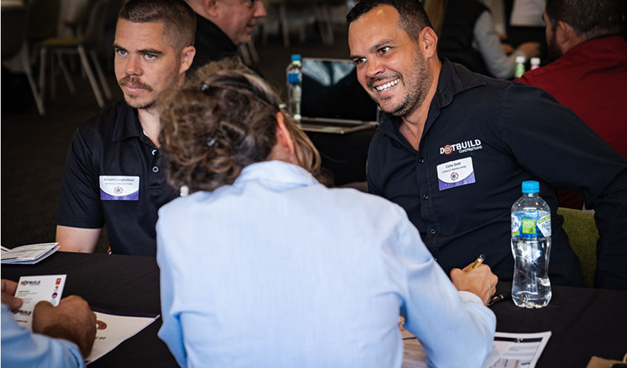
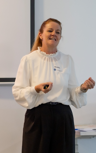
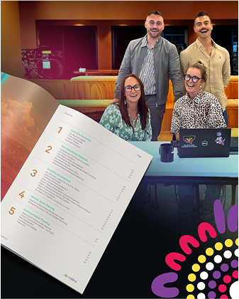
Building Connections.
Every decision was driven by people and purpose. These moments remind us what it’s all for—and who we’re doing it with.
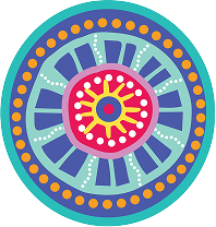
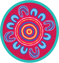
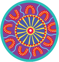
Brand Colours.
The Muru Yulang colour palette was carefully selected to reflect the brand’s identity—conveying trust, professionalism, and market expertise. It ensures consistency across all digital and print materials, helping to build strong and recognisable brand presence. The chosen colours were also designed to complement Campbelltown City Council’s brand guidelines, allowing for cohesive visual alignment in all joint communications.
Brand Fonts.
A thoughtfully selected typography set that enhances Muru Yulang’s brand identity. The chosen fonts ensure readability, professionalism, and cultural authenticity, maintaining consistency across all digital and print materials while reinforcing a strong and cohesive brand presence.


Custom Iconography.
A cohesive set of clean, modern icons that visually communicate Propertybuyer’s services and key concepts. Designed for clarity and consistency, the icons enhance user experience across digital and print materials, reinforcing brand identity.
Project Values.
Our visual identity is more than just design — it reflects who we are and what we stand
for.
Every touchpoint, from how we communicate to how we show up visually, reinforces Muru Yulang’s professionalism, cultural pride, and commitment to meaningful relationships. Consistency across all platforms helps build trust, ensure clarity, and reflect the strength of our values in every interaction.
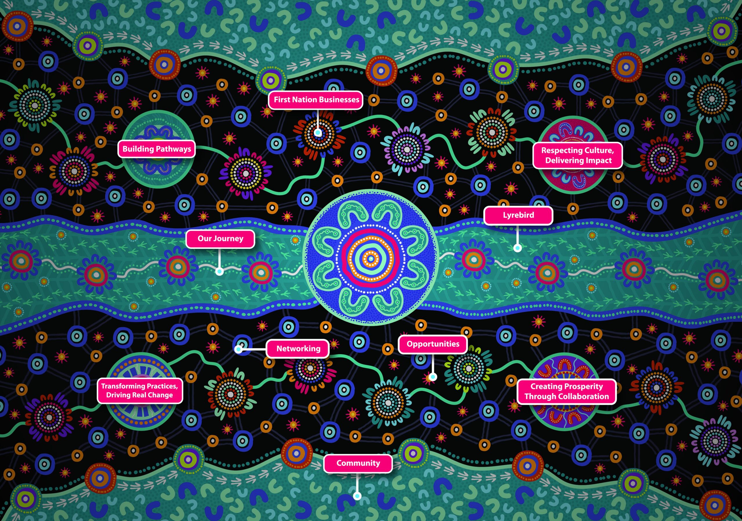
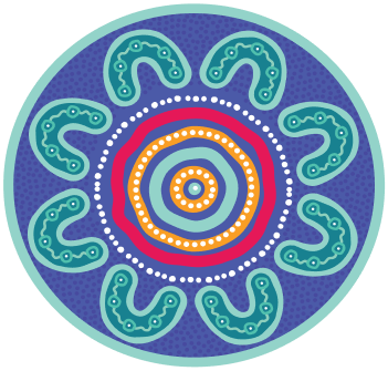
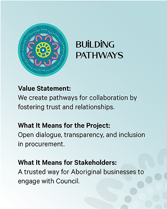
Building Pathways
This motif represents Building Pathways, symb- olising connection,trust, and progress for Aboriginal businesses. The central circular design reflects a space for collaboration and knowledge-sharing, while the layered patterns and pathways illustrate movement toward growth and opportunity. It reinforces our commitment to removing barriers and creating clear, supported
pathways for long-term success.
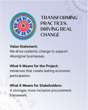
Transforming Practices, Driving Real Change
This motif represents Transforming Practices, Driving Real Change, symbolising progress, innovation, and long-term impact for Aboriginal businesses. The radiating central design reflects the expansion of knowledge and opportunities, while the layered patterns and pathways illustrate the shift from traditional barriers to a more inclusive, sustainable economic landscape.
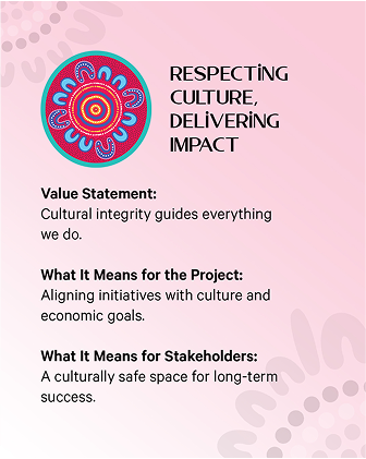
Respecting Culture, Delivering Impact
This symbolises cultural integrity, inclusivity, and meaningful change. The layered circular patterns reflect the depth of cultural knowledge and traditions, while the radiating elements signify the expansion of respect, understanding, and shared prosperity. It reinforces our commitment to creating culturally safe spaces where Aboriginal businesses and councils collaborate, ensuring lasting economic impact and community strength.
Creating Prosperity Through Collaboration
This symbolises unity, shared success, and economic growth. The radiating central design reflects the expansion of opportunity,
while the surrounding interconnected elements represent businesses, councils, and communities working together. It reinforces our commitment to fostering strong partnerships that drive sustainable prosperity and ensure Aboriginal businesses thrive.

Building Pathways
This motif represents Building Pathways, symb- olising connection,trust, and progress for Aboriginal businesses. The central circular design reflects a space for collaboration and knowledge-sharing, while the layered patterns and pathways illustrate movement toward growth and opportunity. It reinforces our commitment to removing barriers and creating clear, supported
pathways for long-term success.
Transforming Practices, Driving Real Change
This motif represents Transforming Practices, Driving Real Change, symbolising progress, innovation, and long-term impact for Aboriginal businesses. The radiating central design reflects the expansion of knowledge and opportunities, while the layered patterns and pathways illustrate the shift from traditional barriers to a more inclusive, sustainable economic landscape.
Respecting Culture, Delivering Impact
This symbolises cultural integrity, inclusivity, and meaningful change. The layered circular patterns reflect the depth of cultural knowledge and traditions, while the radiating elements signify the expansion of respect, understanding, and shared prosperity. It reinforces our commitment to creating culturally safe spaces where Aboriginal businesses and councils collaborate, ensuring lasting economic impact and community strength.
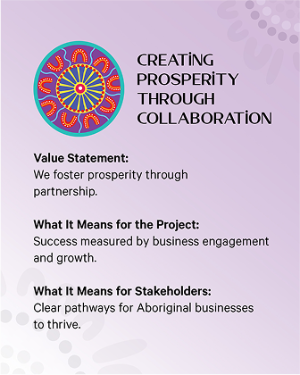
Creating Prosperity Through Collaboration
This symbolises unity, shared success, and economic growth. The radiating central design reflects the expansion of opportunity,
while the surrounding interconnected elements represent businesses, councils, and communities working together. It reinforces our commitment to fostering strong partnerships that drive sustainable prosperity and ensure Aboriginal businesses thrive.
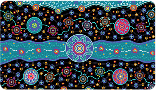
Visualising Our Values.
The lyrebird tracks at the heart of this artwork symbolise our shared journey, rooted in Dharawal Country. Representing adaptability, resilience, and connection, the lyrebird reflects the strength of Aboriginal businesses, communities, and councils. These tracks guide us forward, illustrating our collective path toward cultural empowerment and lasting success.
Acknowledging
the Artist.
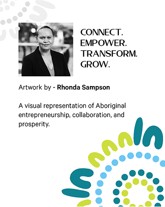
Rhonda Sampson’s bio
Rhonda Sampson, a Kamilaroi artist and graphic designer, owns RS Creative Solutions in Campbelltown, Sydney.
Since 2019, she has won awards and created artworks for Macarthur Square, Campbelltown Sports Stadium, Optus, and WestConnex.
Her Dawn Reflection Artwork for Australia Day 2023 at the Sydney Opera House gained international recognition.
She also contributes to Reconciliation Action Plans, inspiring Aboriginal and Torres Strait Islander communities.
Artwork By-
Rhonda Sampson
Symbolic Storytelling
Through Design.
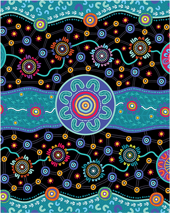
Each visual motif in this collection is rooted in Aboriginal symbolism and thoughtfully crafted to reflect the brand’s values, connection, growth, and empowerment. These icons are more than decorative elements; they serve as powerful storytelling tools across print and digital touchpoints.


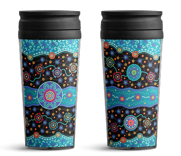
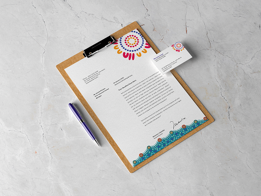
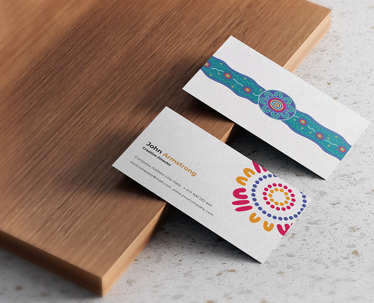
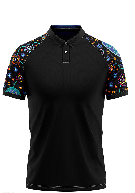
Custom Merchandise.
A carefully crafted set of branded merchandise was created, This included letterheads, envelopes, notepads, business cards, T-shirts, and Coffee Keep-cup, as well a canvas carry bag in the same spirit and design. They speak with one voice, strong and steady, building trust and leaving a lasting impression in every exchange.
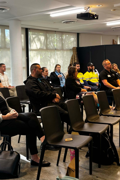
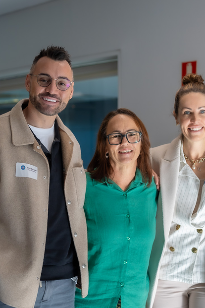
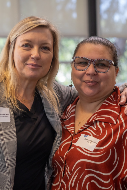
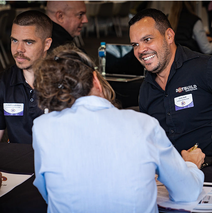
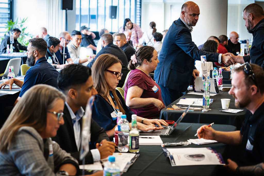
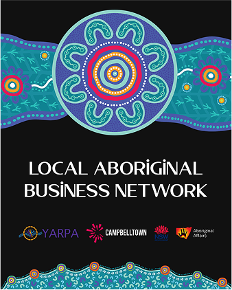
Networking Events.
Connections that count
Muru Yulang was developed in partnership with Yarpa Hub and Campbelltown City Council as part of the Deliver Better Outcomes program an initiative to strengthen Aboriginal business engagement across the region. Co-designed with community leaders, business owners, and stakeholders, the brand was shaped through inclusive workshops and deep listening. Featuring artwork by Kamilaroi designer Rhonda Sampson, Muru Yulang is a culturally grounded identity built to enhance visibility, remove barriers, and support the growth of First Nations businesses.
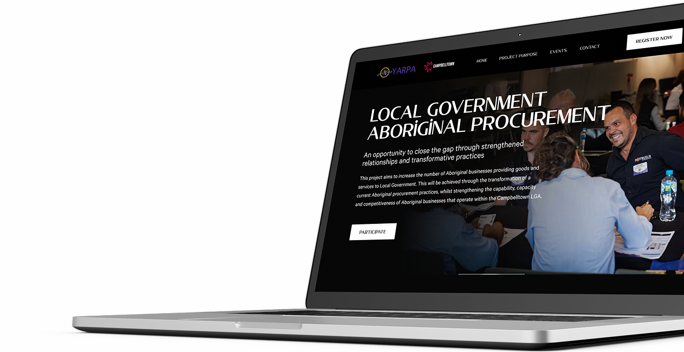
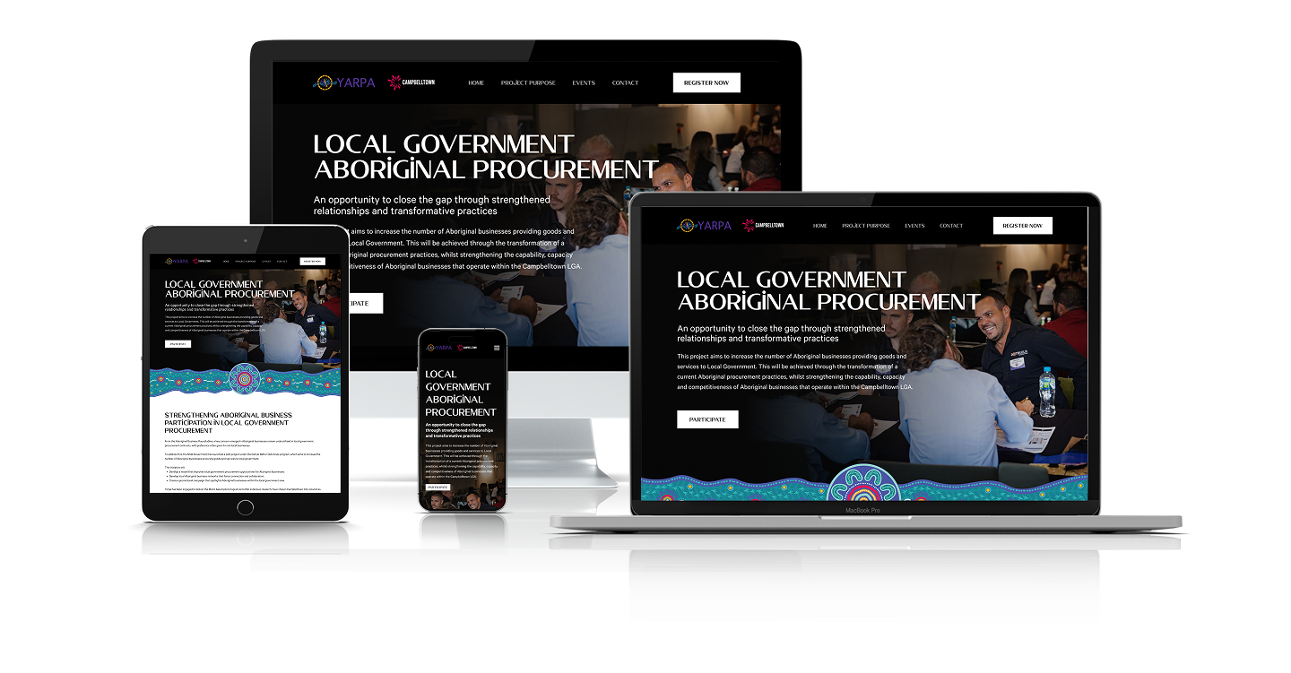
Landing Page.
A dedicated landing page was created for Muru Yulang to promote the Local Government Aboriginal Procurement initiative. Designed for all devices, it ensures a seamless user experience while reinforcing Muru Yulang’s brand identity. The page communicates the mission clearly, reflecting professionalism, cultural inclusivity, and a strong commitment to empowering Aboriginal businesses across New South Wales.
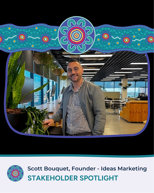
Stakeholder Spotlight.
The Ideas team was selected as the Marketing and Communications partner for the Deliver Better Outcomes project a collaboration between Aboriginal Affairs NSW, Yarpa, and Campbelltown City Council.
As a proud Anaiwan man and Founder of Ideas, I’m honoured to support this important initiative, which champions Aboriginal business participation across the Campbelltown region.
My connection to Yarpa is ongoing. I continue to support their work through strategic storytelling, design, and culturally aligned communications. Together, we focus on visibility, connection, and opportunity for First Nations businesses.
Scott Bouquet
Founder & Director
Anaiwan
It’s the details
that count
We built a cohesive digital presence for Yarpa, from culturally respectful social content to engaging campaigns, delivering a strong, community-led brand experience that reflects their values and mission.
Every detail counts. From designed resources to culturally grounded social content and marketing, each element reflects Yarpa’s focus on empowerment and excellence. The refreshed brand identity brings consistency and respect to every touchpoint.

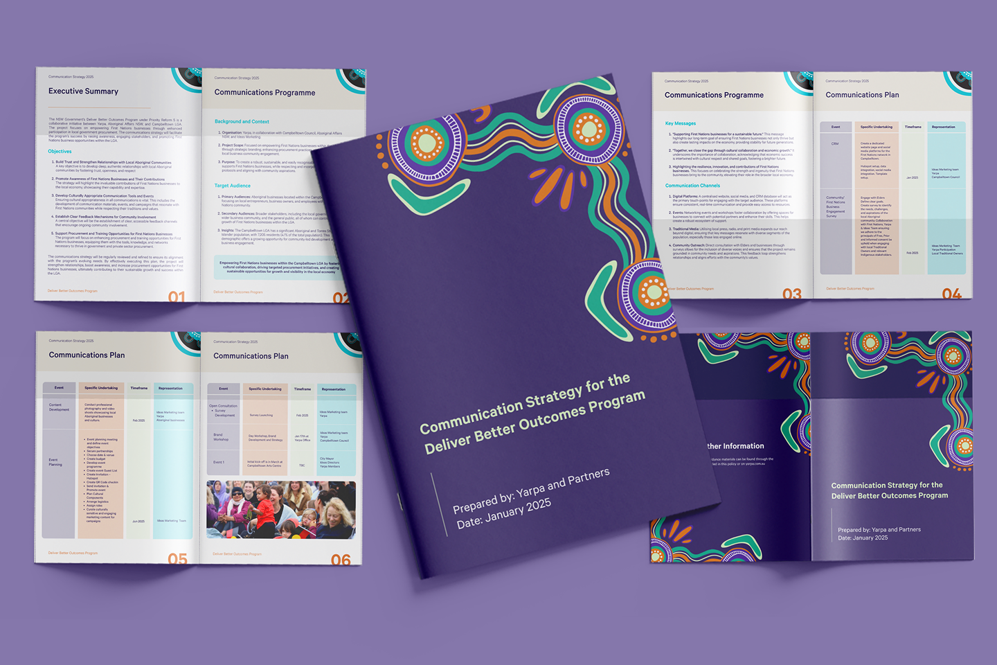
Communications
Strategy.
A professionally crafted Communications Strategy, built on a clear and unified visual identity. Every message, channel, and touchpoint speaks with one voice, steady, strong, and grounded, reinforcing Muru Yulang’s credibility, professionalism, and trust across all communication mediums.
Related Projects.
Explore other projects where we have successfully delivered innovative branding and marketing solutions that have transformed businesses and elevated their market presence.