Hubspot Services


 Call us now
 1300 643 327

 PREVIOUS


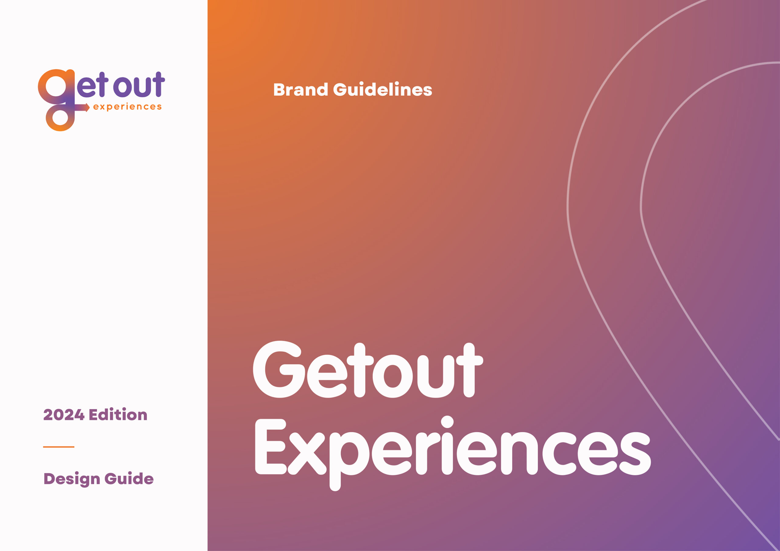
Building the Brand, Shaping the Experience.
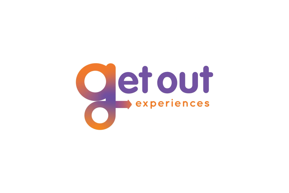
brand new logo.
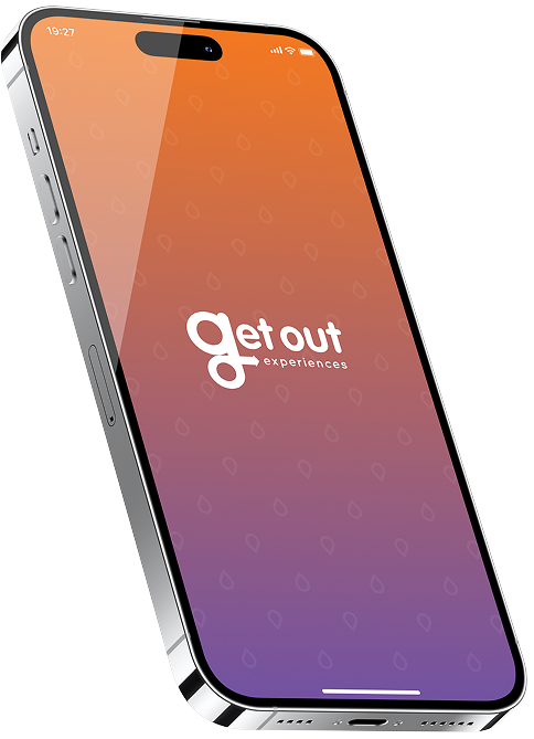
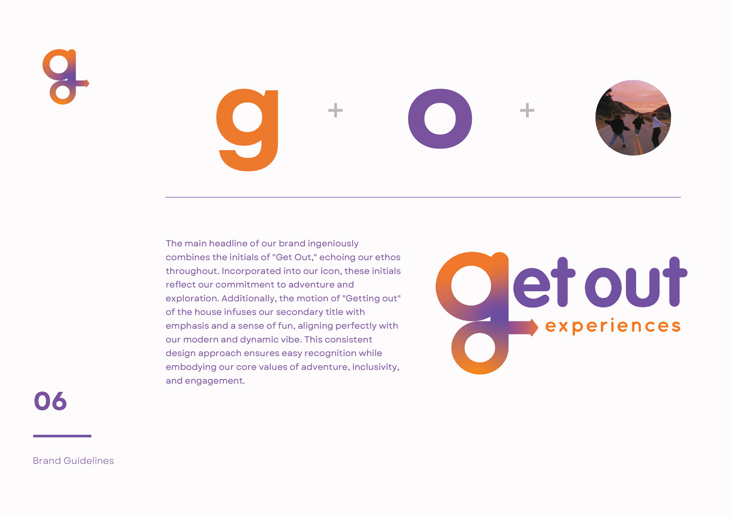
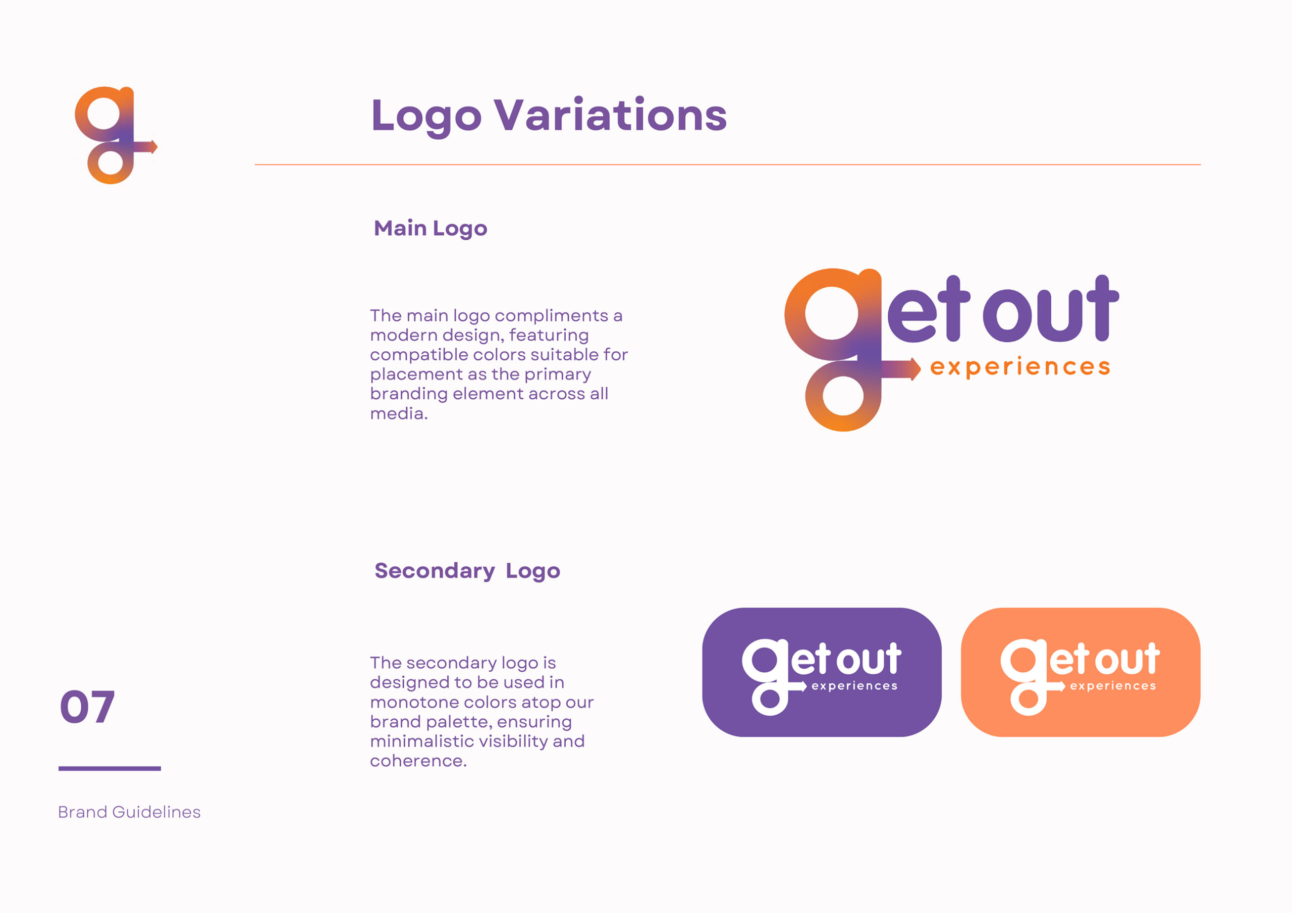
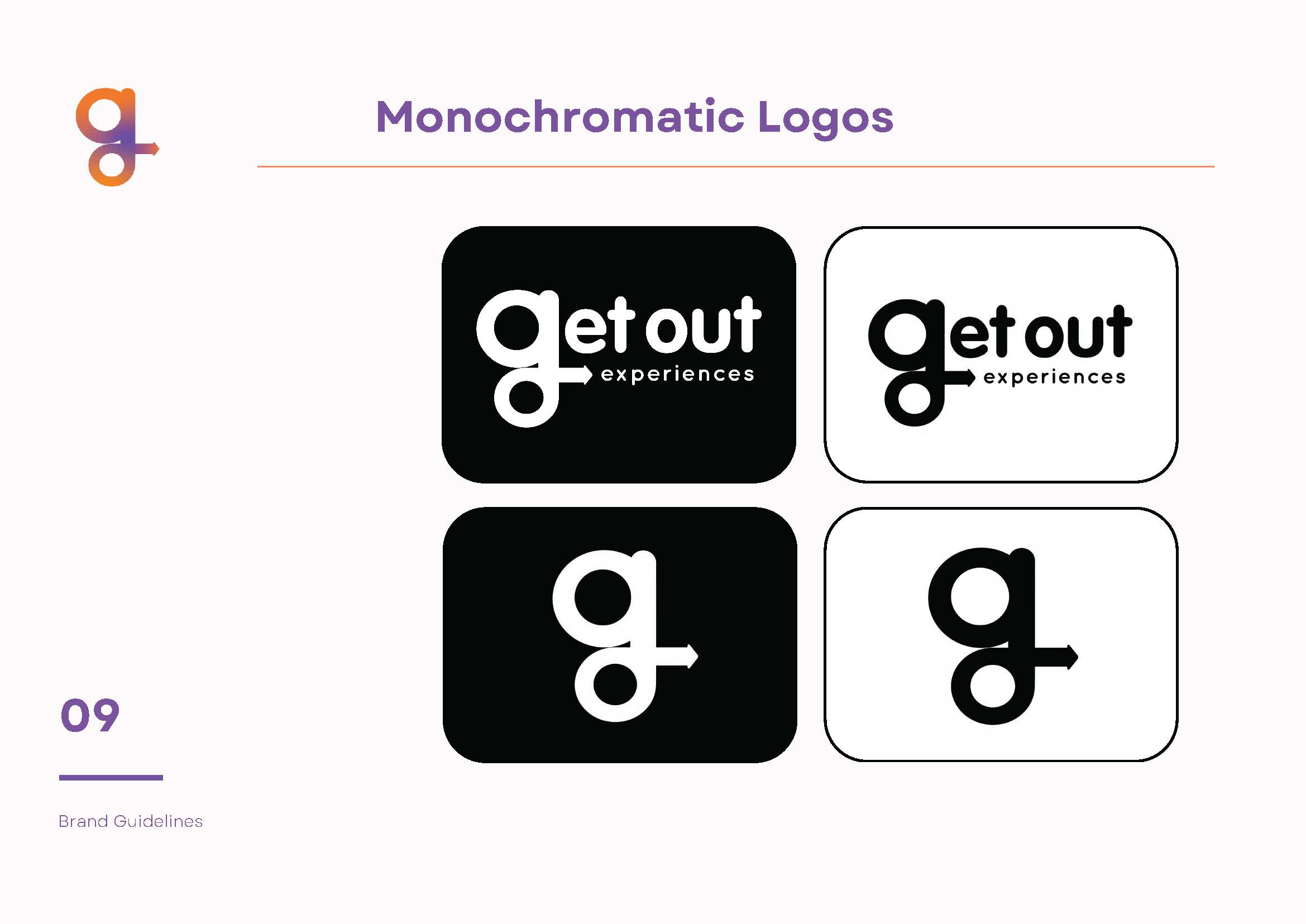
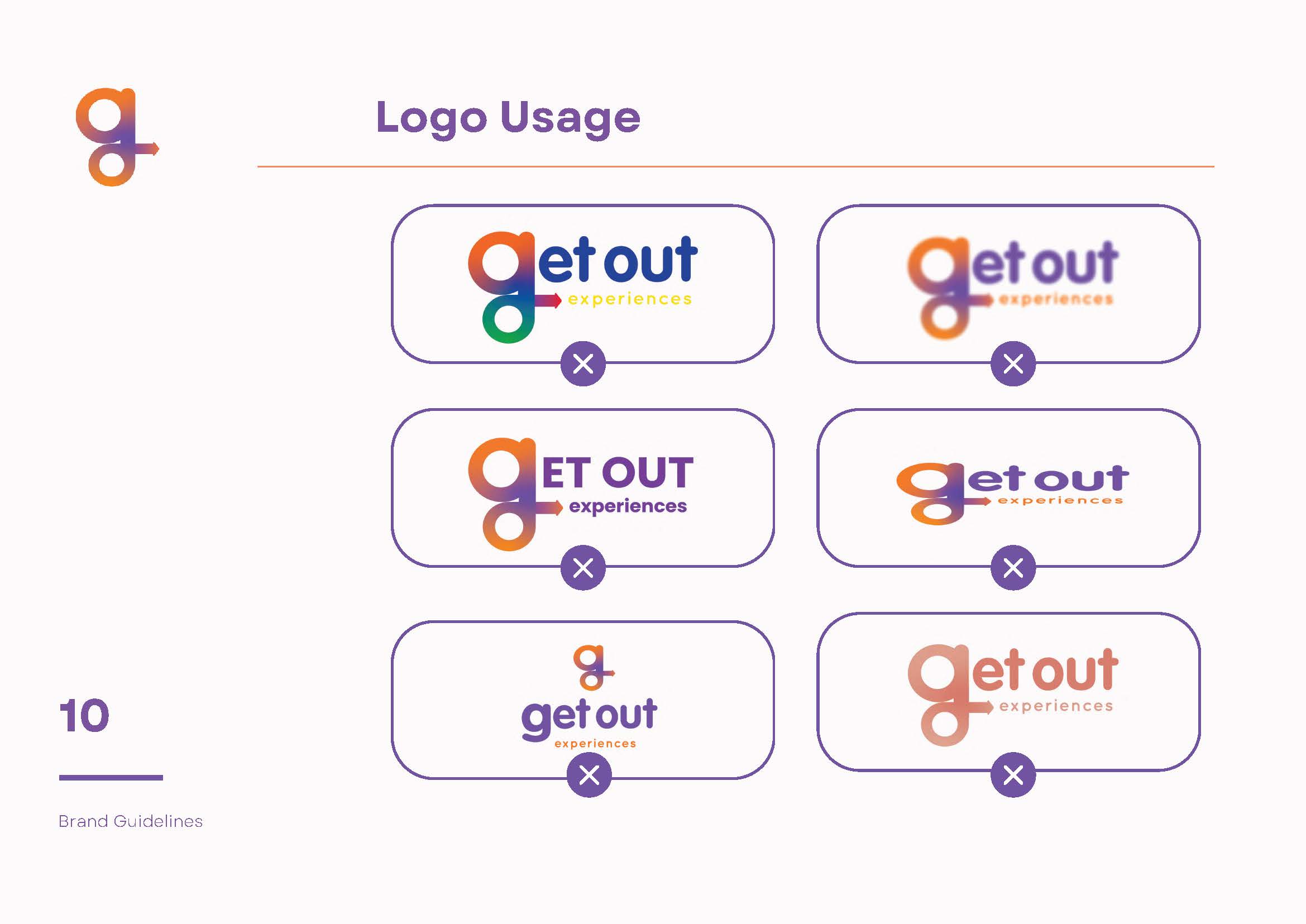
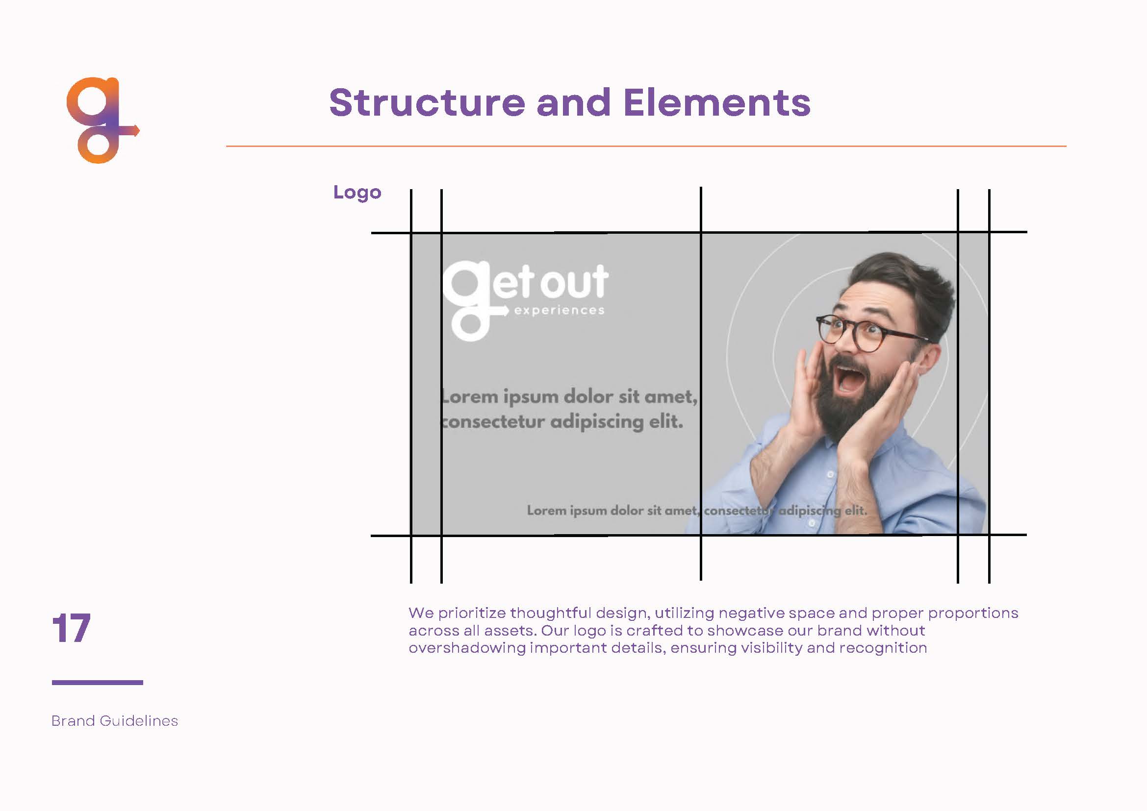
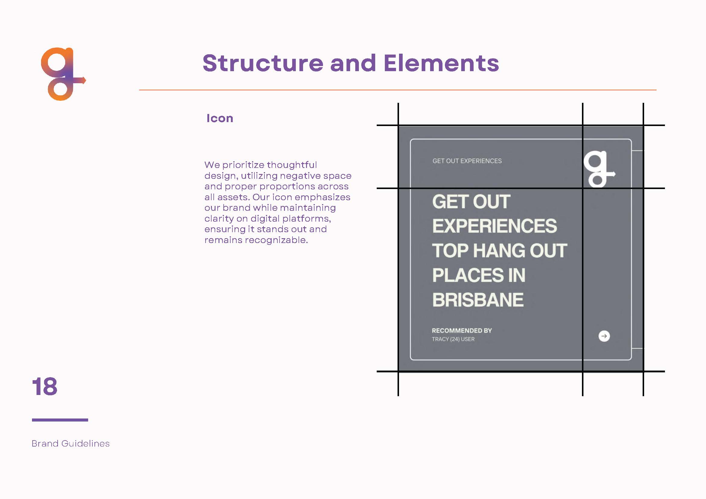
The Get Out Experiences (GOE) logo was introduced to capture the spirit of adventure and simplicity at the heart of the platform. Featuring modern typography paired with a dynamic symbol, it reflects the mission of making collaborative exploration effortless. Bold, vibrant, and highly versatile, the design establishes a strong, memorable visual presence across all platforms.


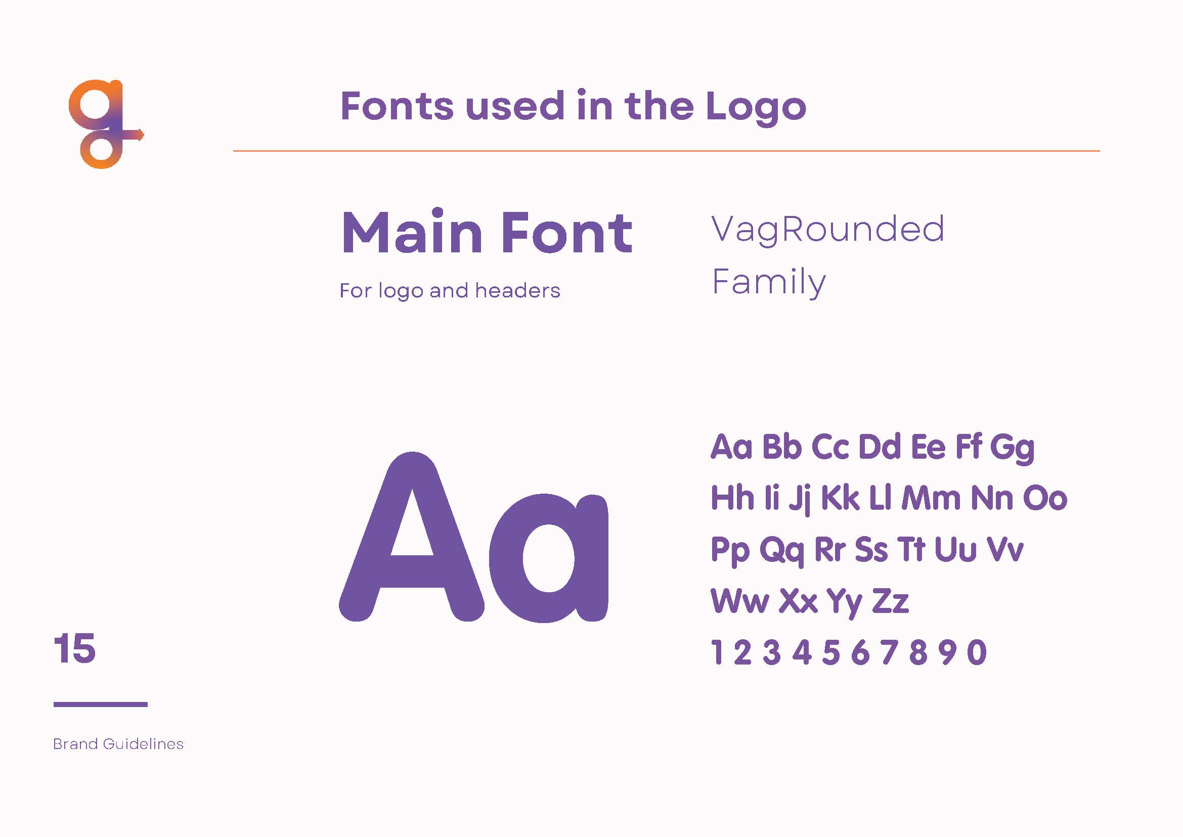
brand fonts.
Get Out Experiences uses VAG Rounded in Bold and Light weights to reflect its friendly, modern feel. The rounded forms add warmth and approachability, while the bold style brings energy and focus. The light weight keeps things clean and easy to read across both digital and print. It’s a type choice that matches the app’s tone is simple, social, and fun to use.


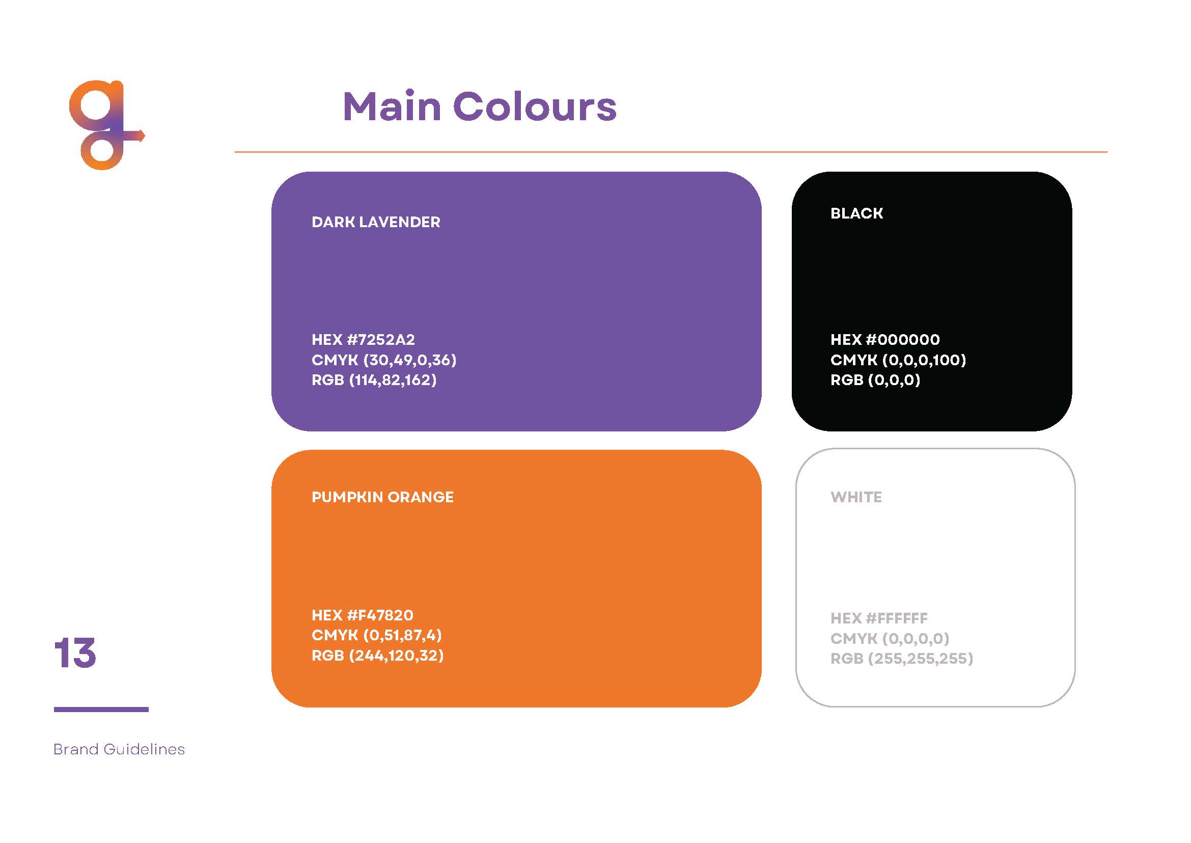
Get Out Experience Purple
Get Out Experience Orange
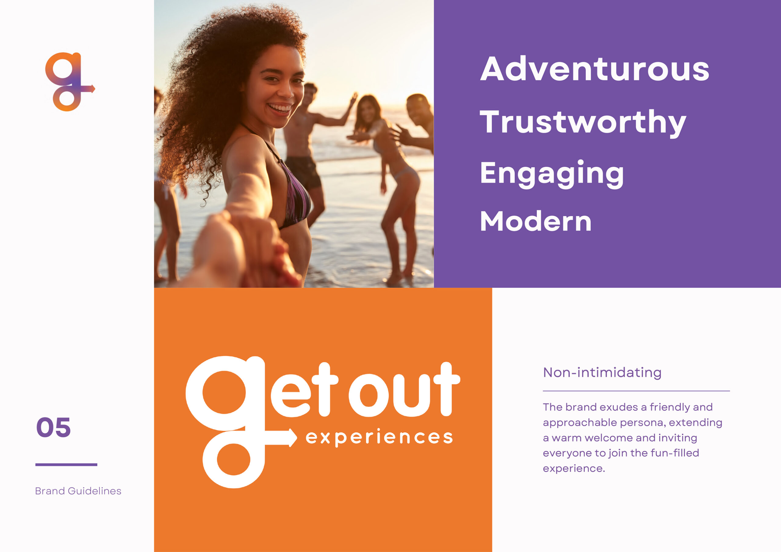
brand colours.
Orange and purple are at the heart of the Get Out brand. Orange brings energy, optimism, and a sense of movement, reflecting the app’s active, social focus.
Purple adds contrast and depth, giving the brand a confident, creative edge. Together, they strike a balance between fun and function, helping GOE stand out while staying clear and cohesive across every touchpoint.


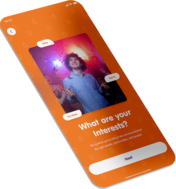
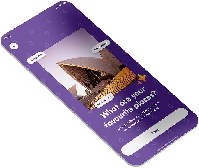
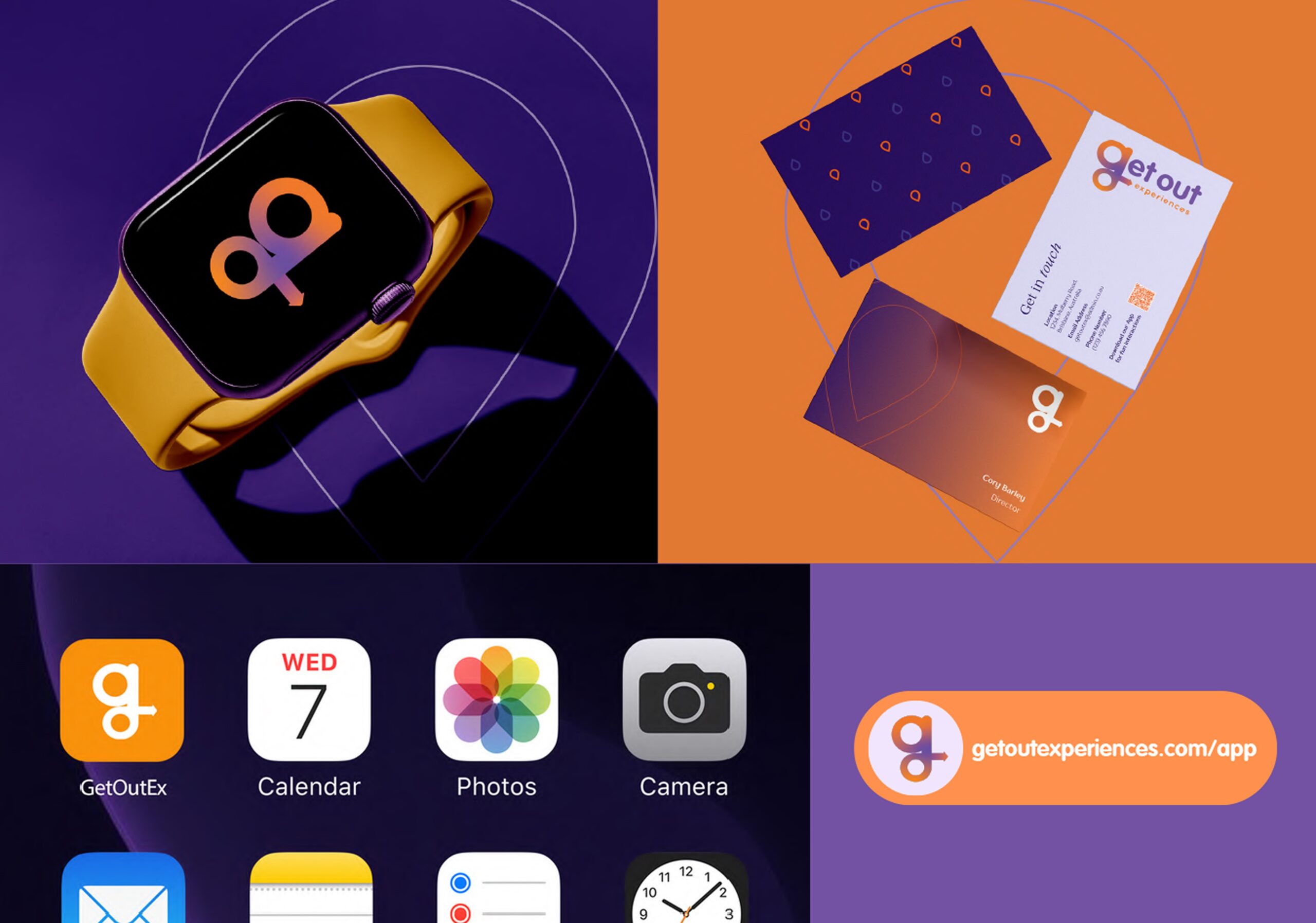
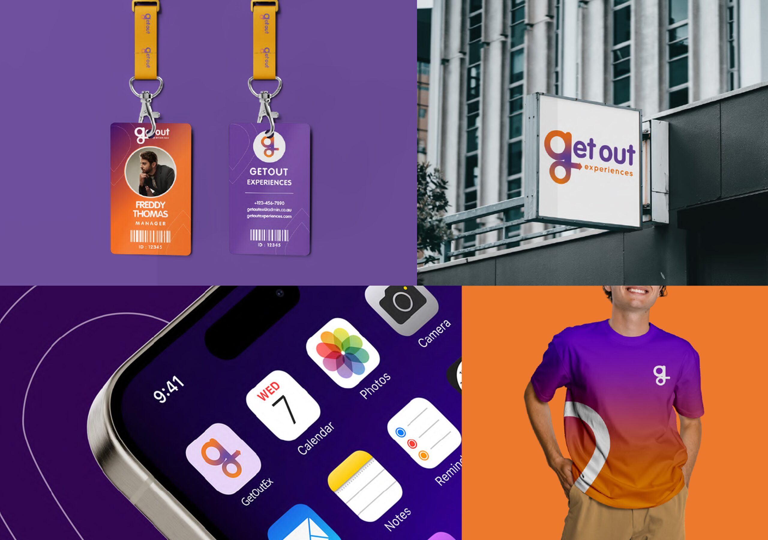
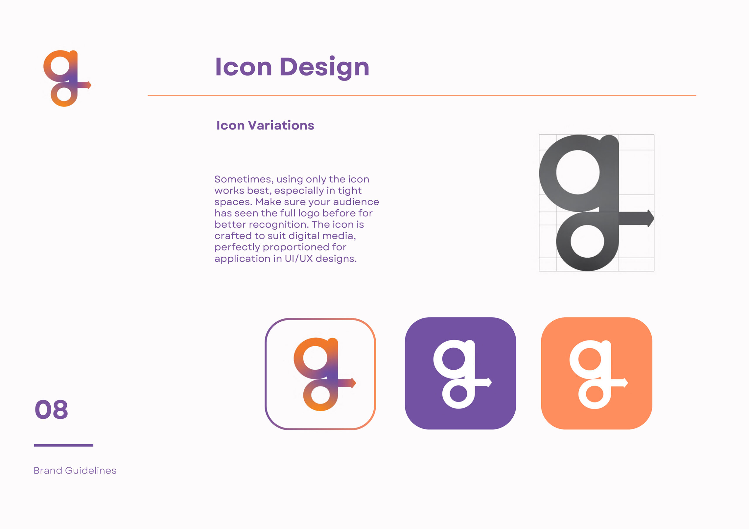
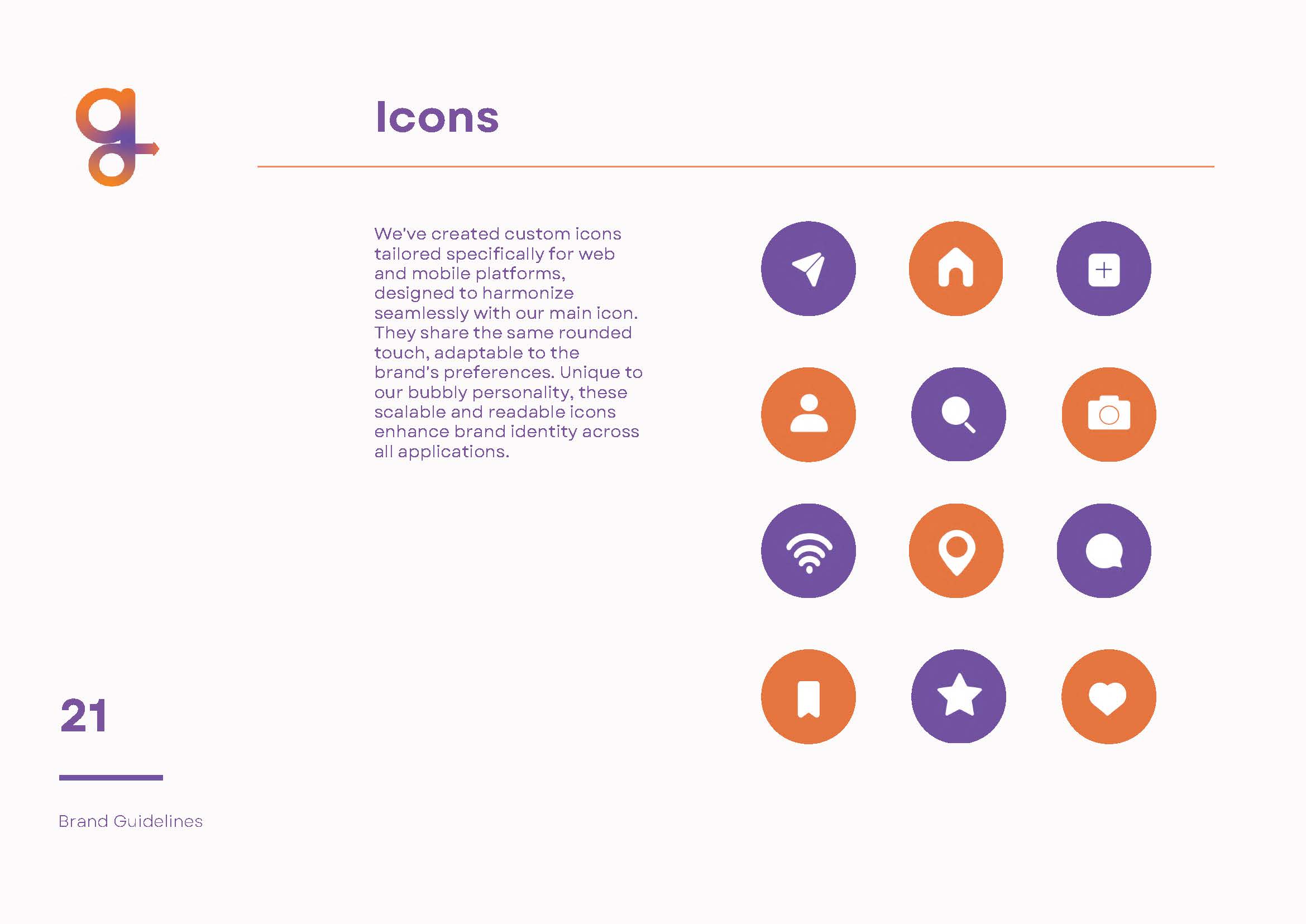
Custom Iconography.
We created a custom icon set to match GOE’s rounded, playful style. Designed for both web and mobile, the icons are clear, flexible, and recognisable at any size. They help deliver a seamless experience across the app and brand, reinforcing GOE’s friendly and consistent visual language.
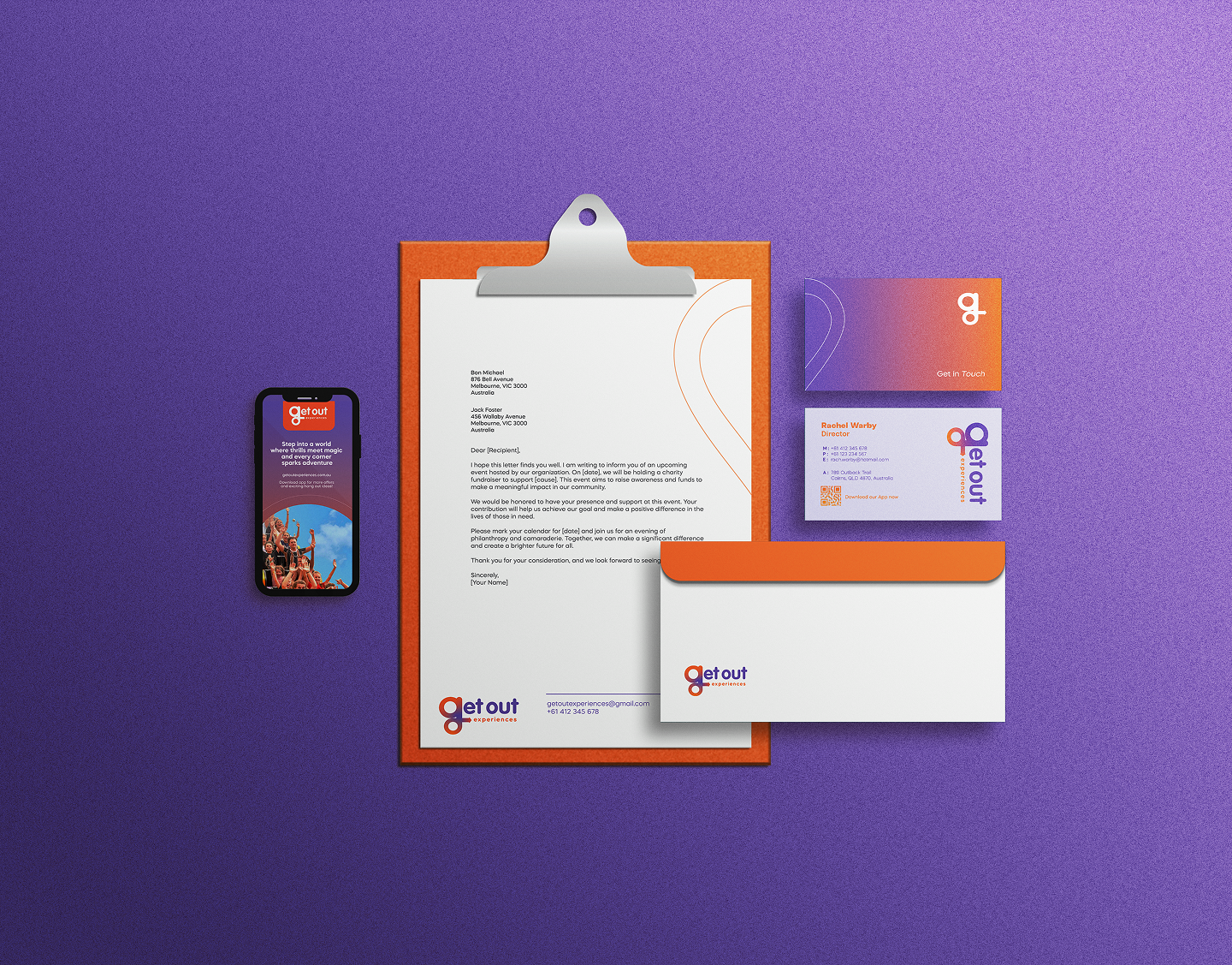
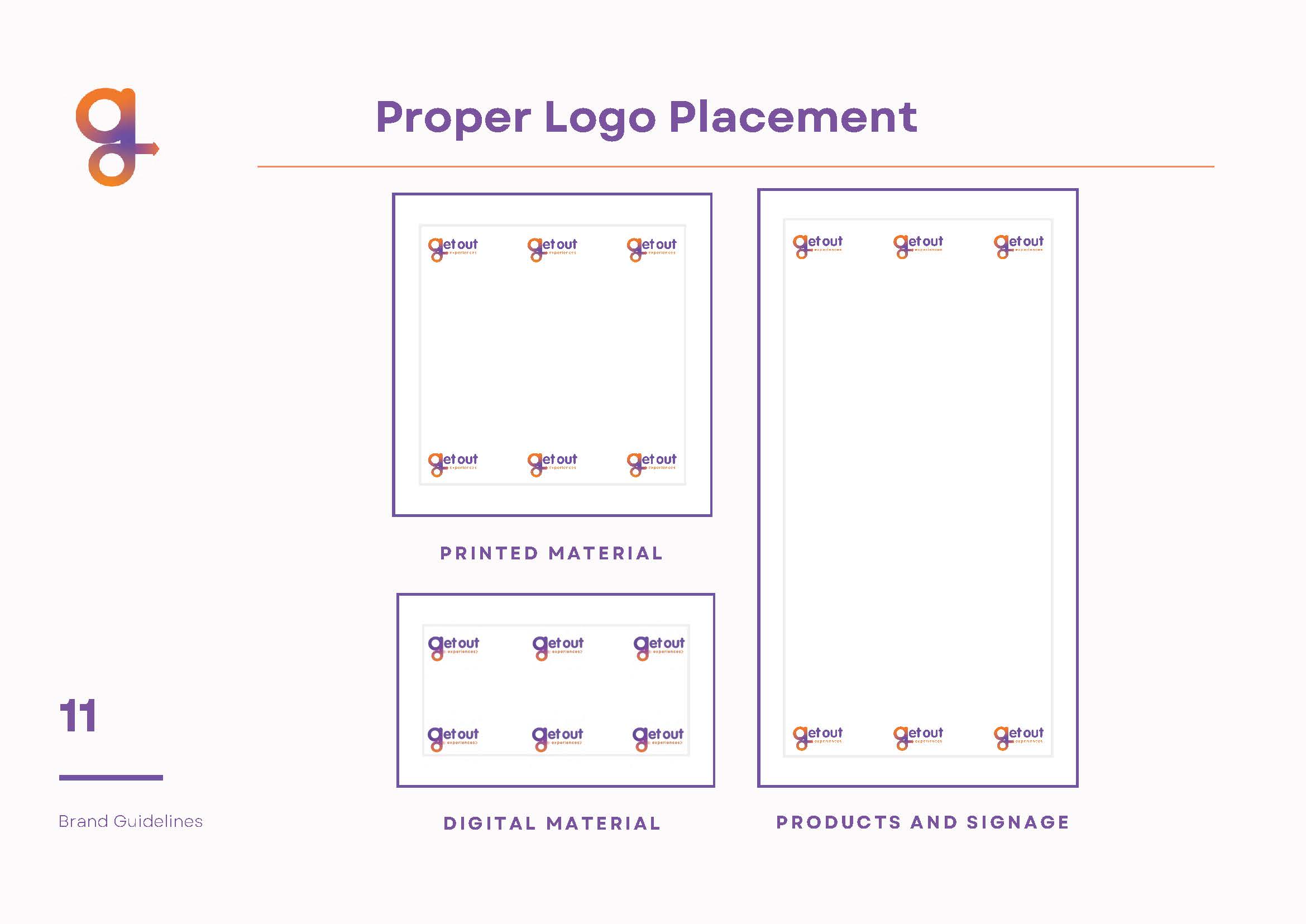
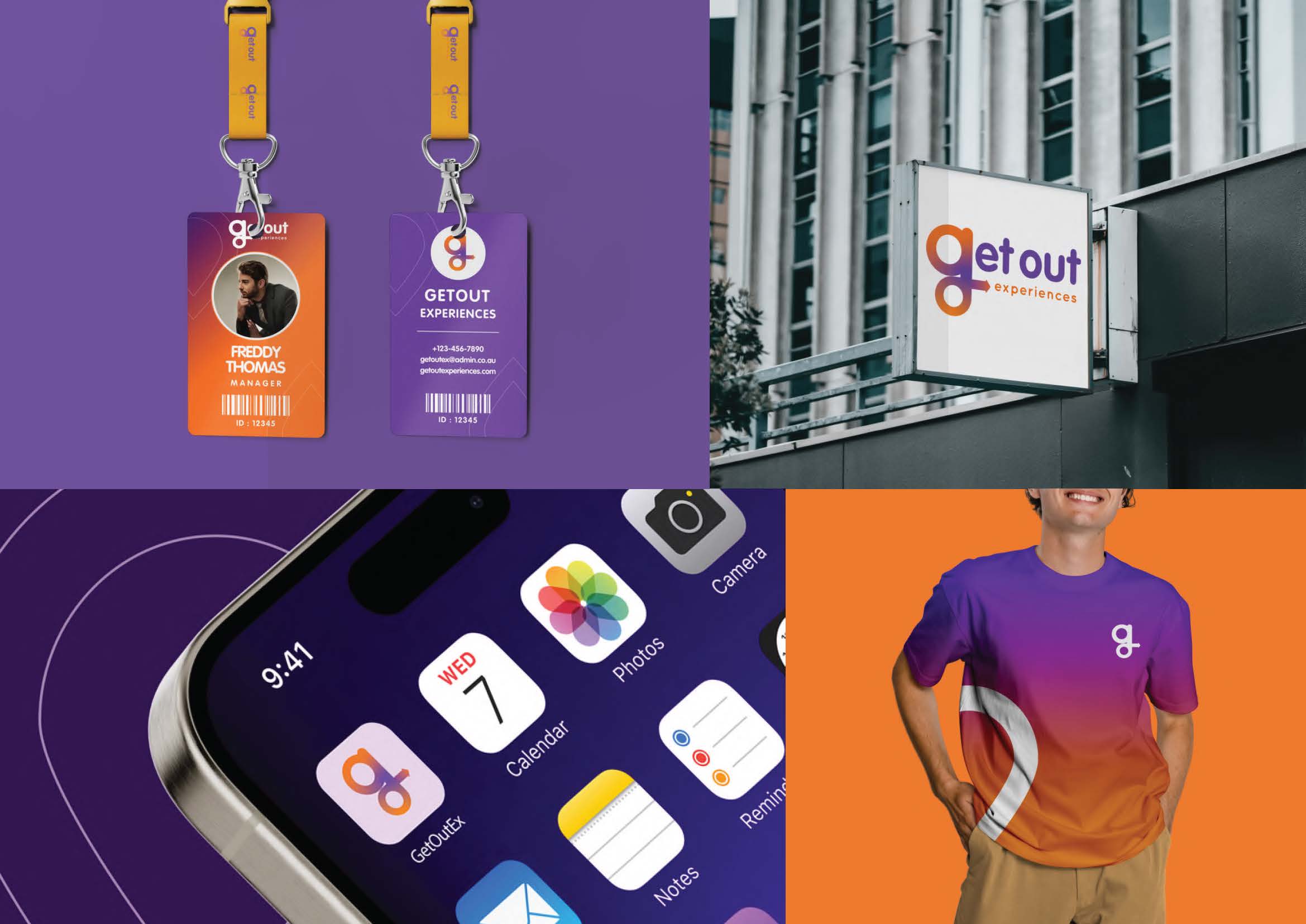
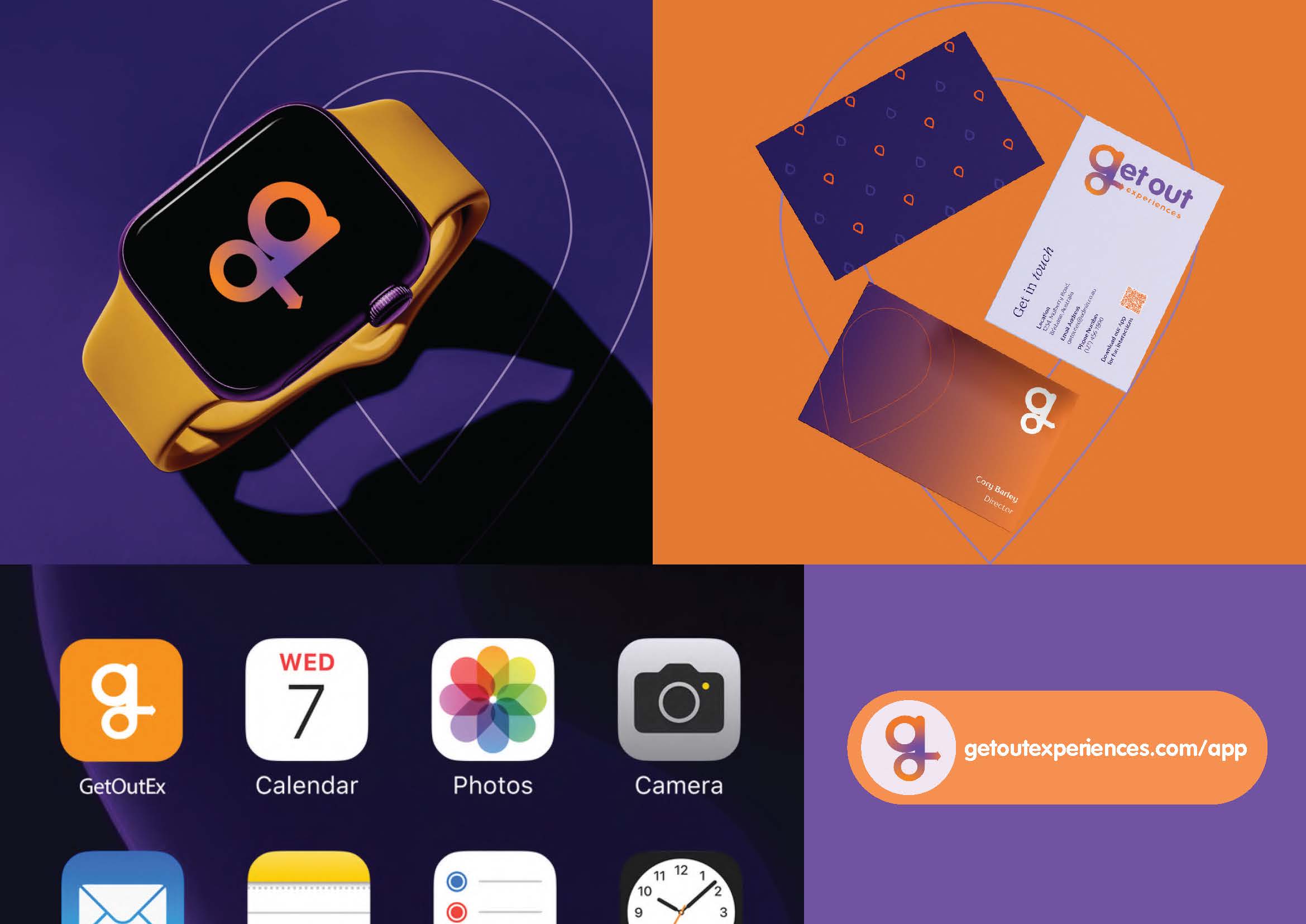
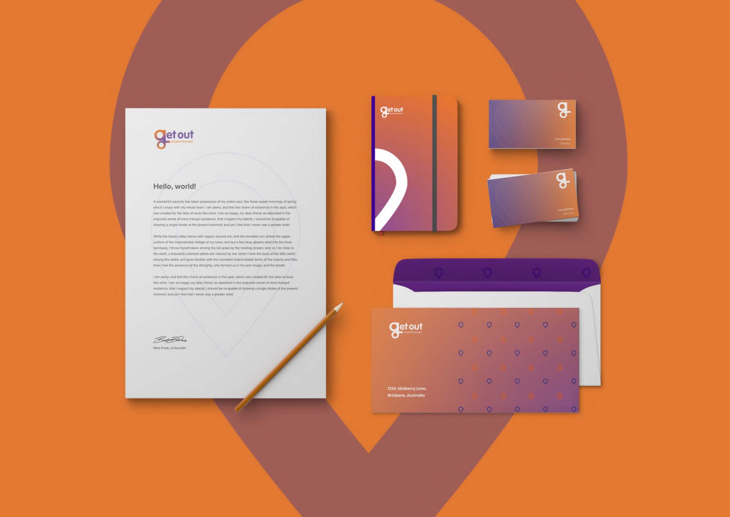
Stationery.
We created a full suite of branded stationery for GOE—including letterheads, envelopes, notepads, and business cards. Each item carries the same bold, energetic look as the app—balancing a sense of adventure with a clean, professional finish. It’s brand consistency that carries through every touchpoint, both digital and physical.
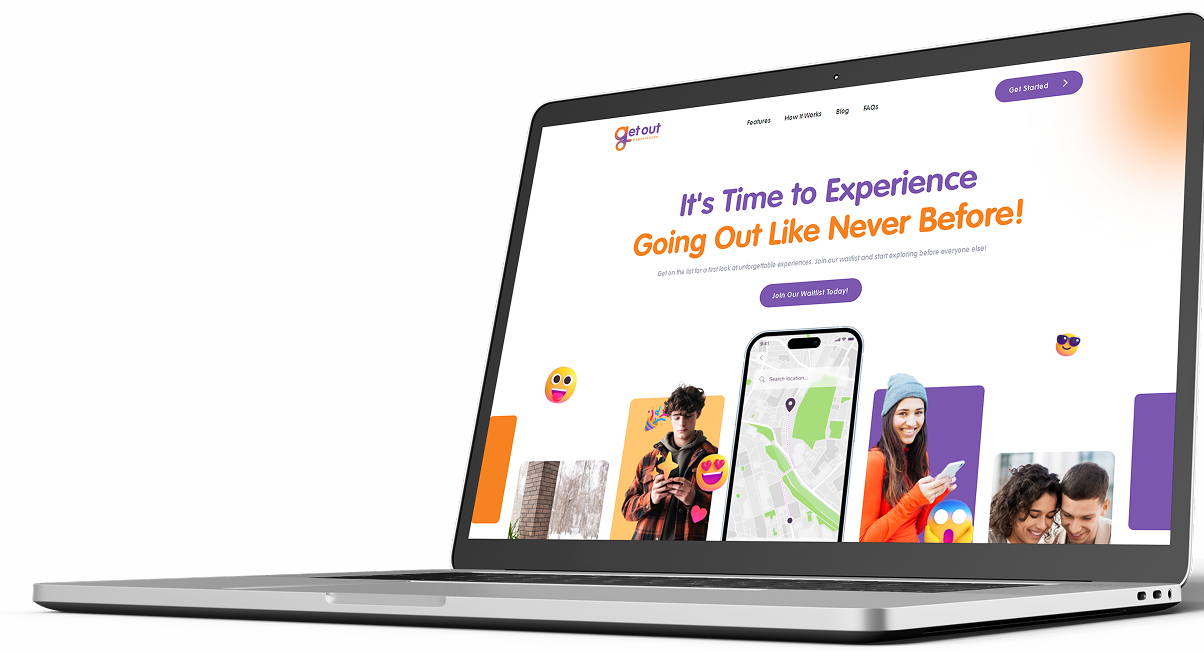
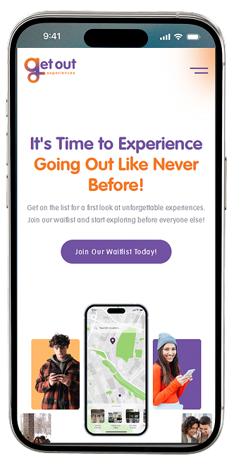
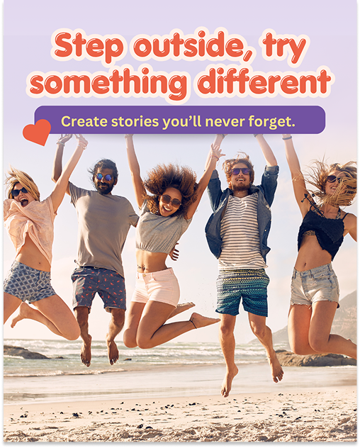
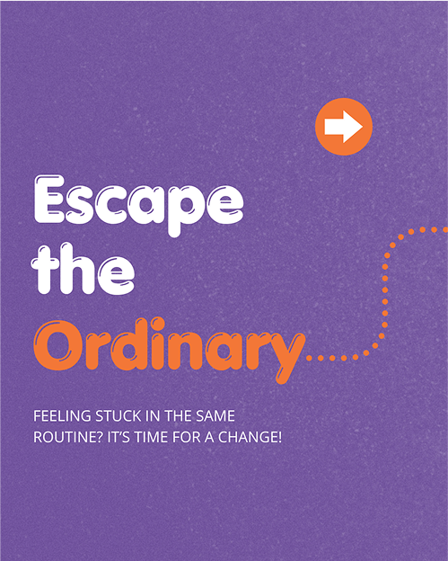
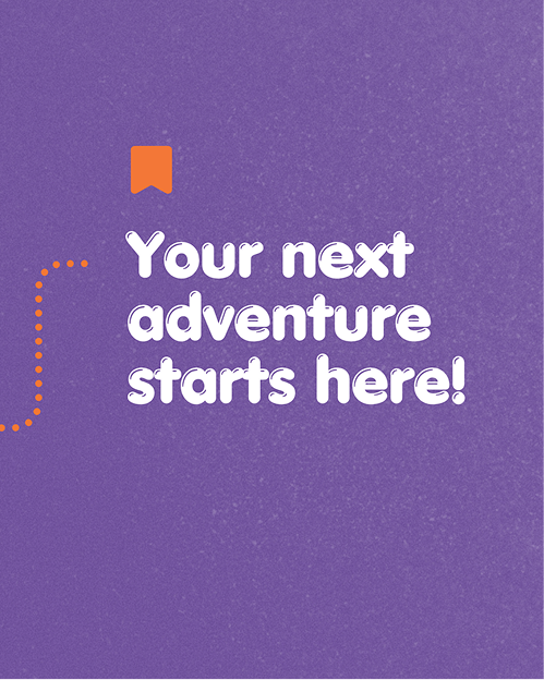
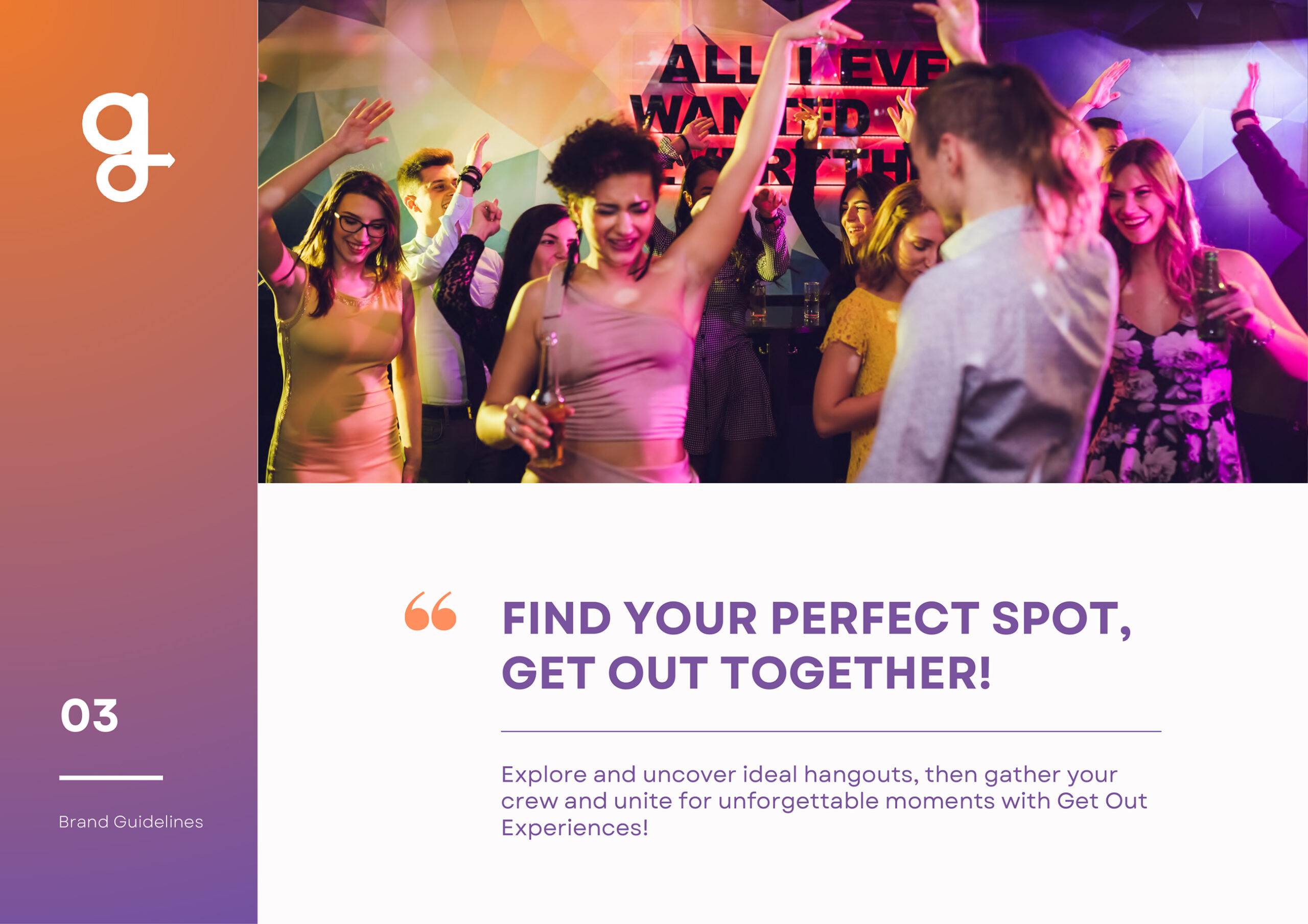
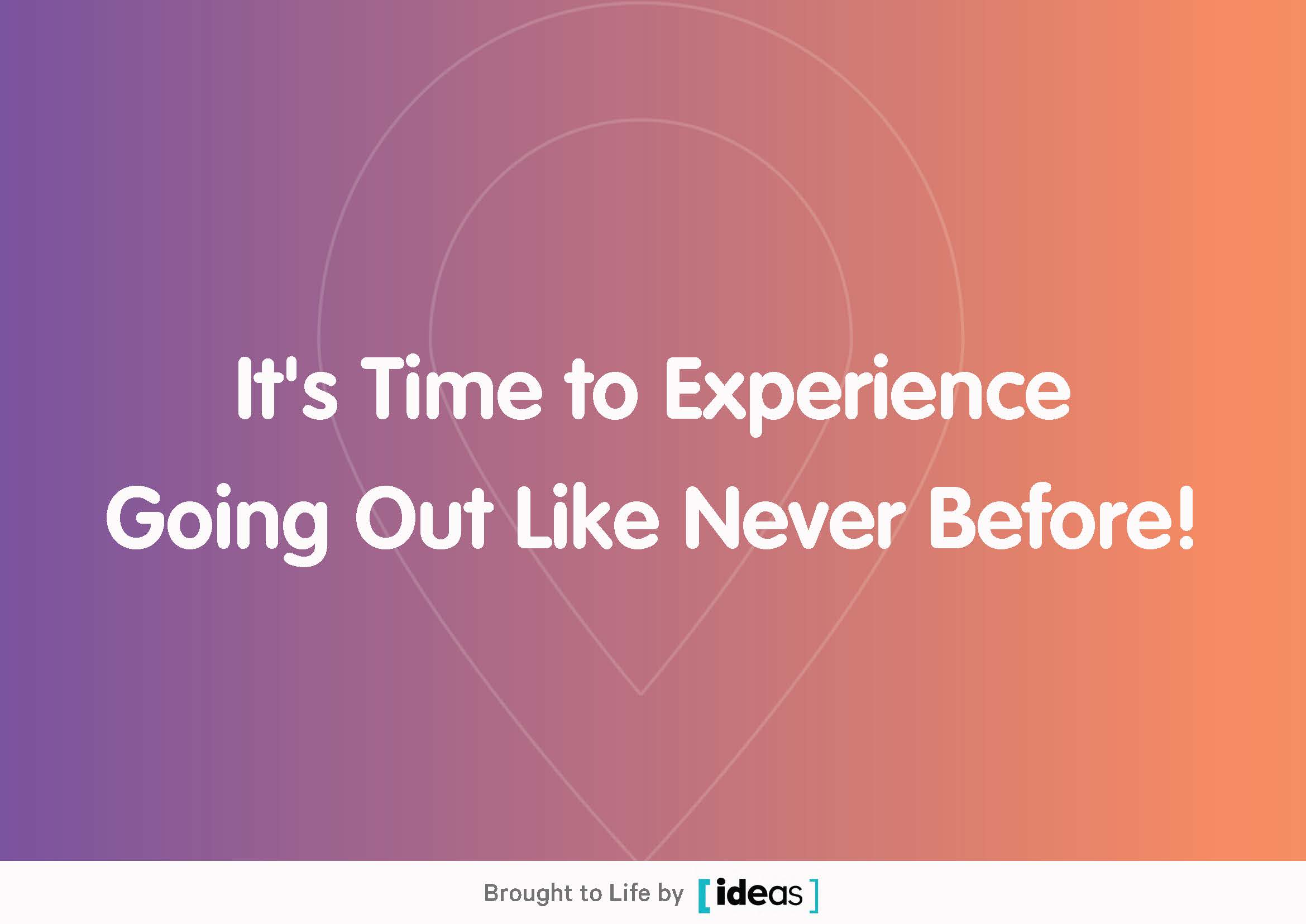
It's Time to Experience Going Out Like Never Before!

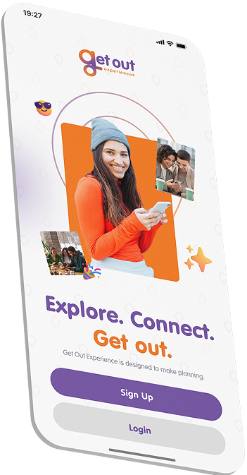
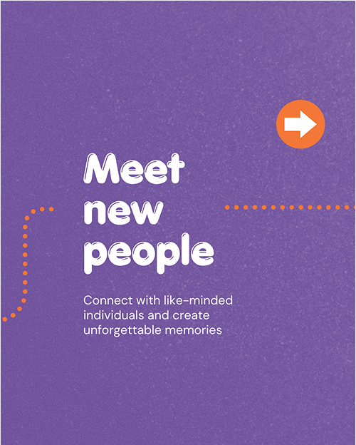
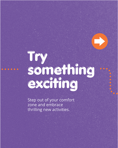
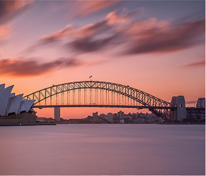
Bringing Adventure to Your Fingertips.
We created a custom icon set that reflects GOE’s rounded, playful style. Designed for both web and mobile, the icons are clear, flexible, and recognisable at any size. They enhance the user experience across the app and brand while reinforcing GOE’s friendly and consistent visual language.


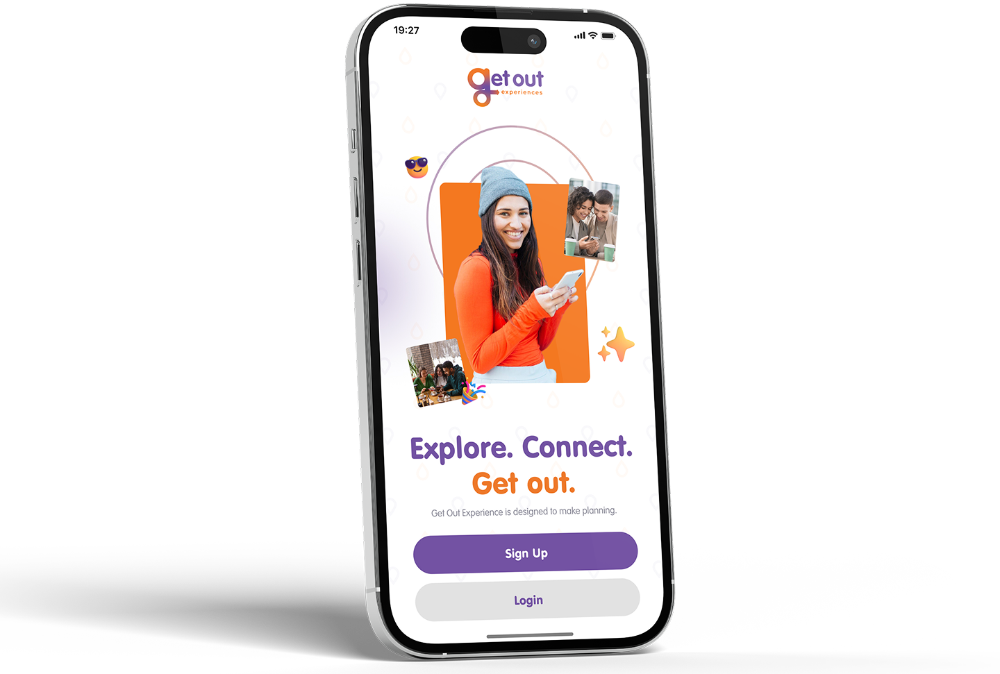
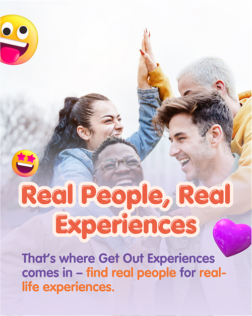
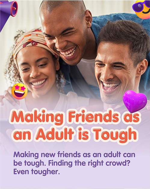
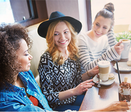
Connecting People Through Shared Adventures.
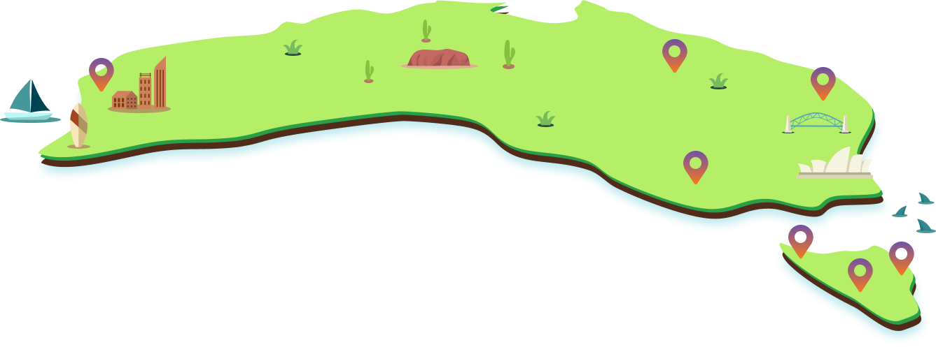
We designed Get Out Experience to do more than just guide—it brings people together. With collaborative tools like shared trip planning, real-time location features, and interactive maps, the app turns group outings into seamless, memorable adventures. Coupled with striking visual identity and smart digital strategy, GOE empowers users to explore together, build stronger bonds, and make every outing count.

It's Time to Experience Going Out Like Never Before!


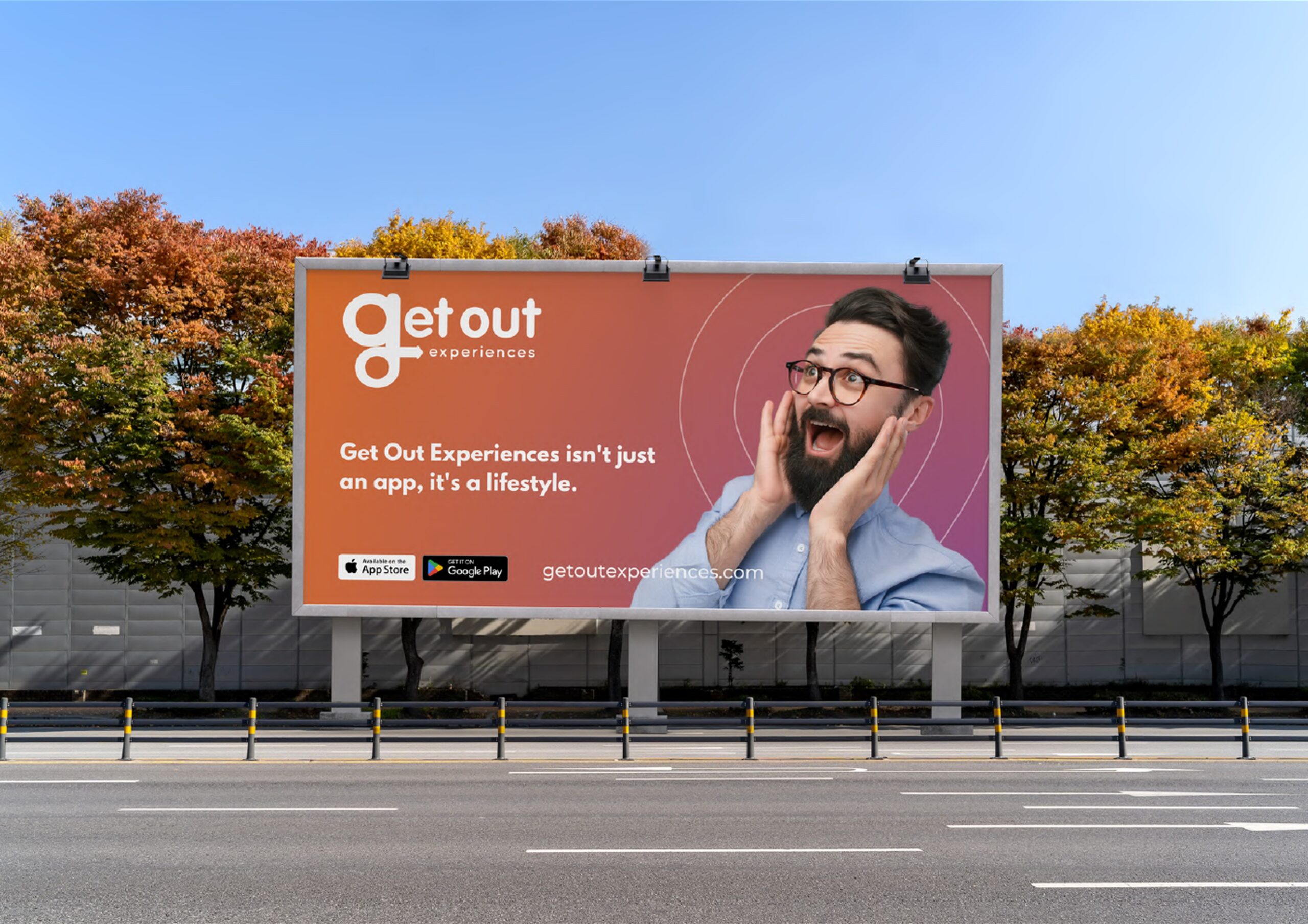
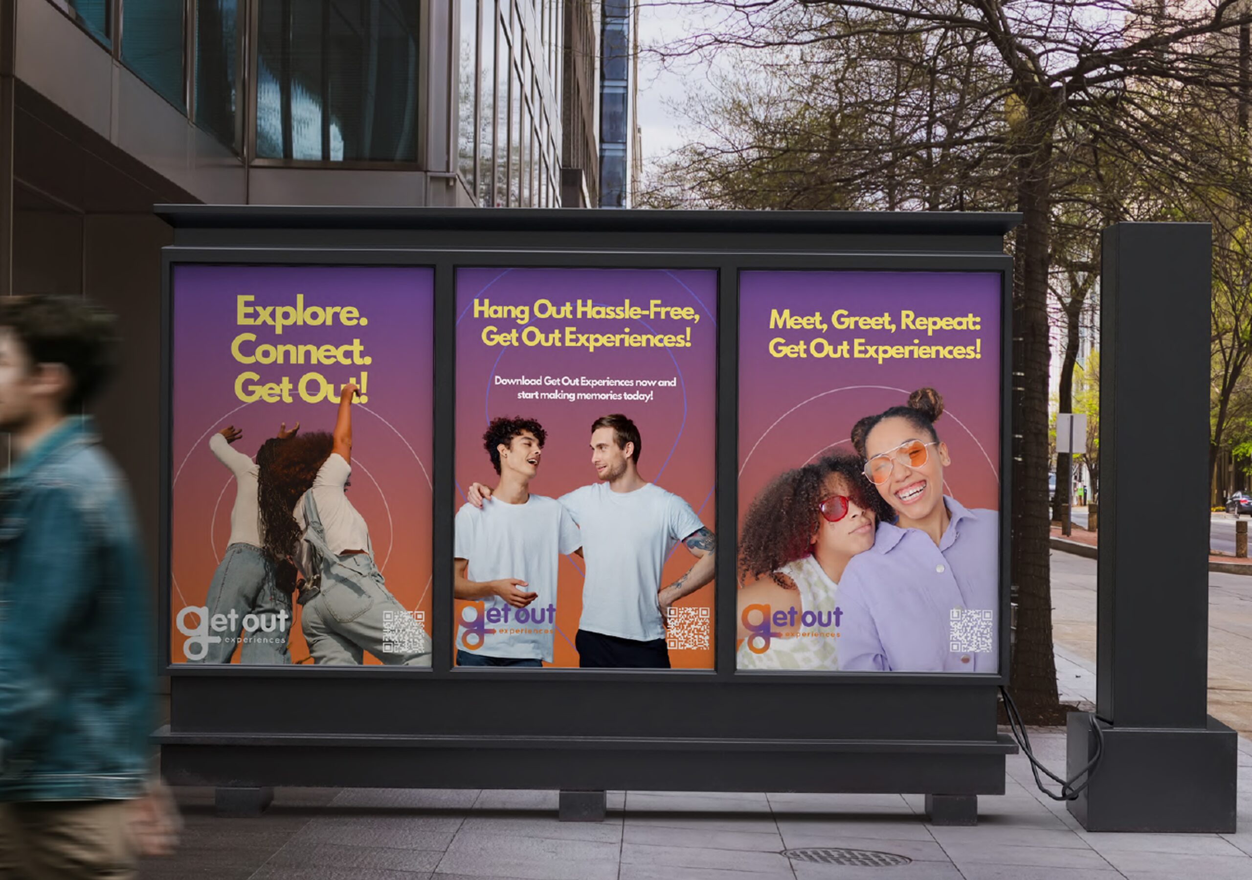
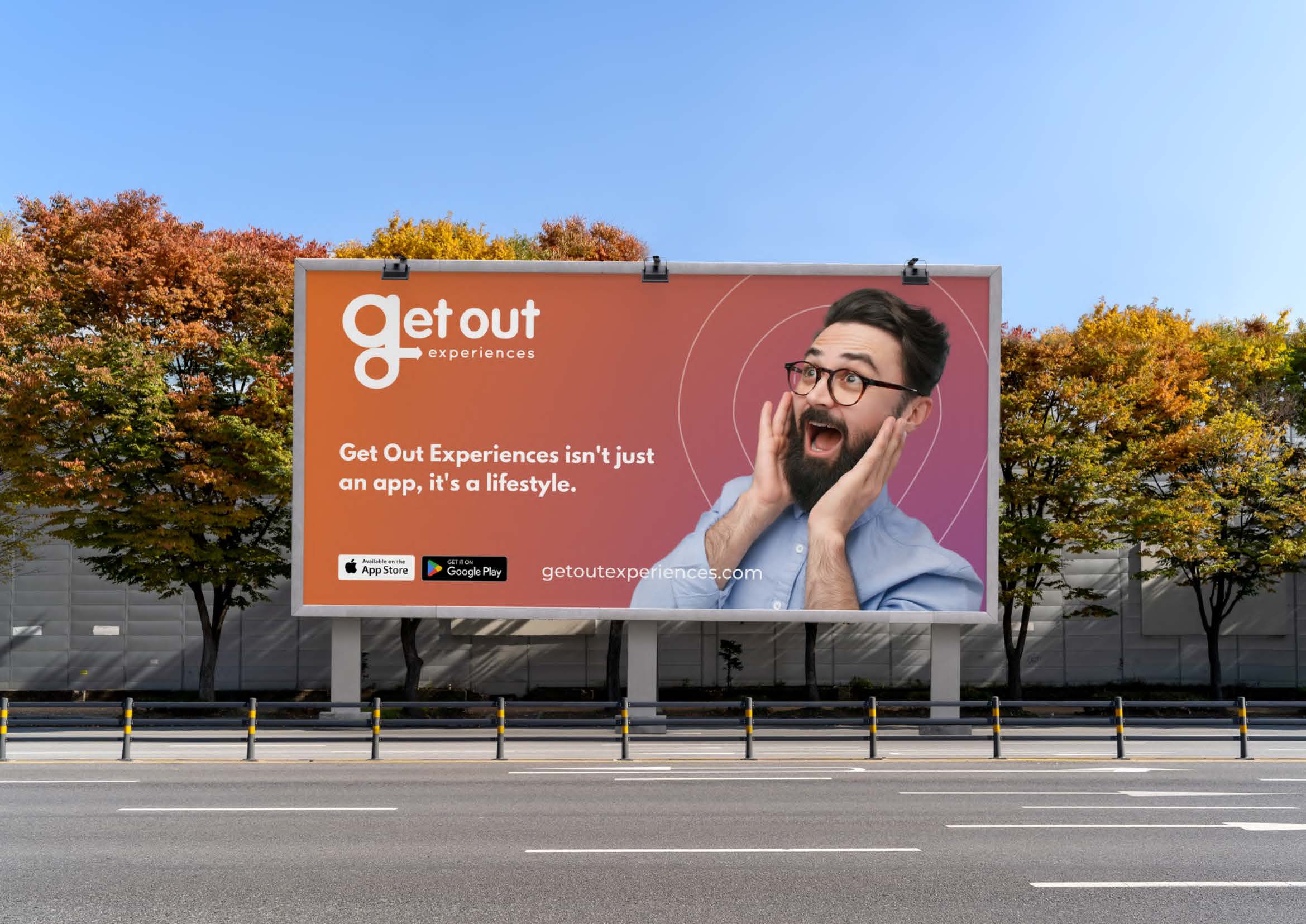
Signage.
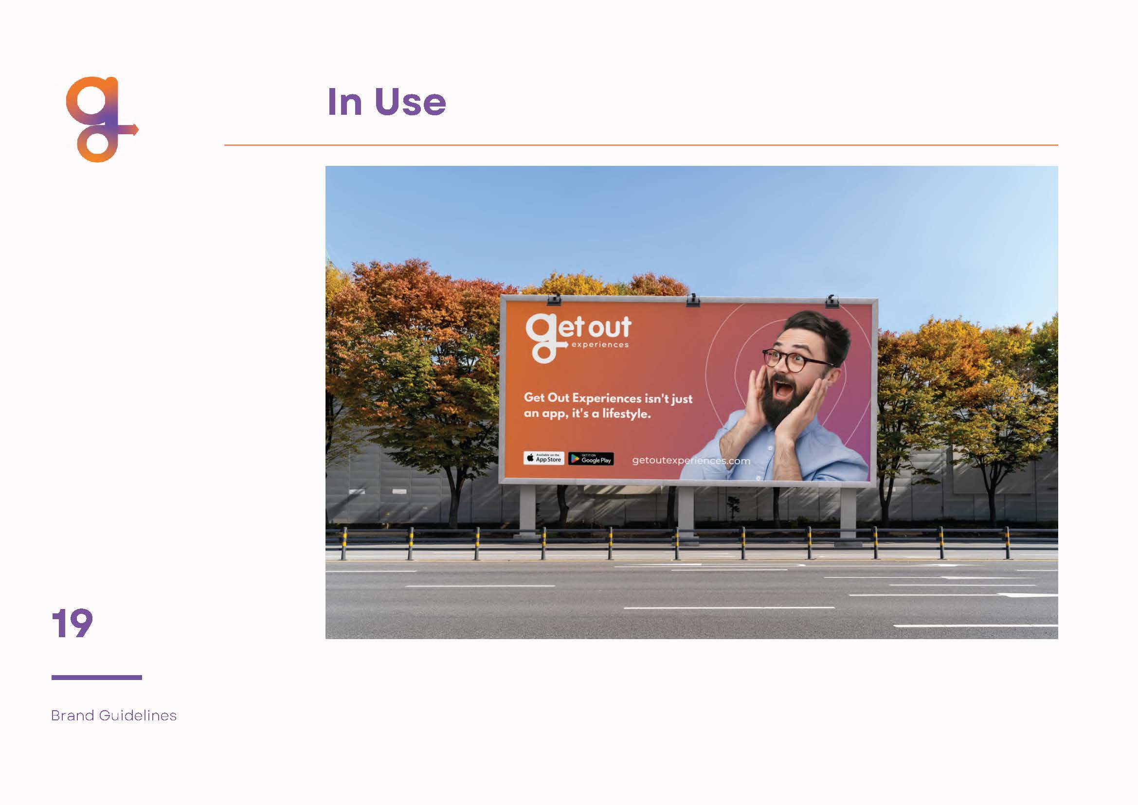
We designed bold, high-impact signage for Get Out Experiences, built for visibility and recognition. From office spaces to event banners, each piece captures the brand’s energy and adventurous tone, creating a memorable presence wherever it appears.


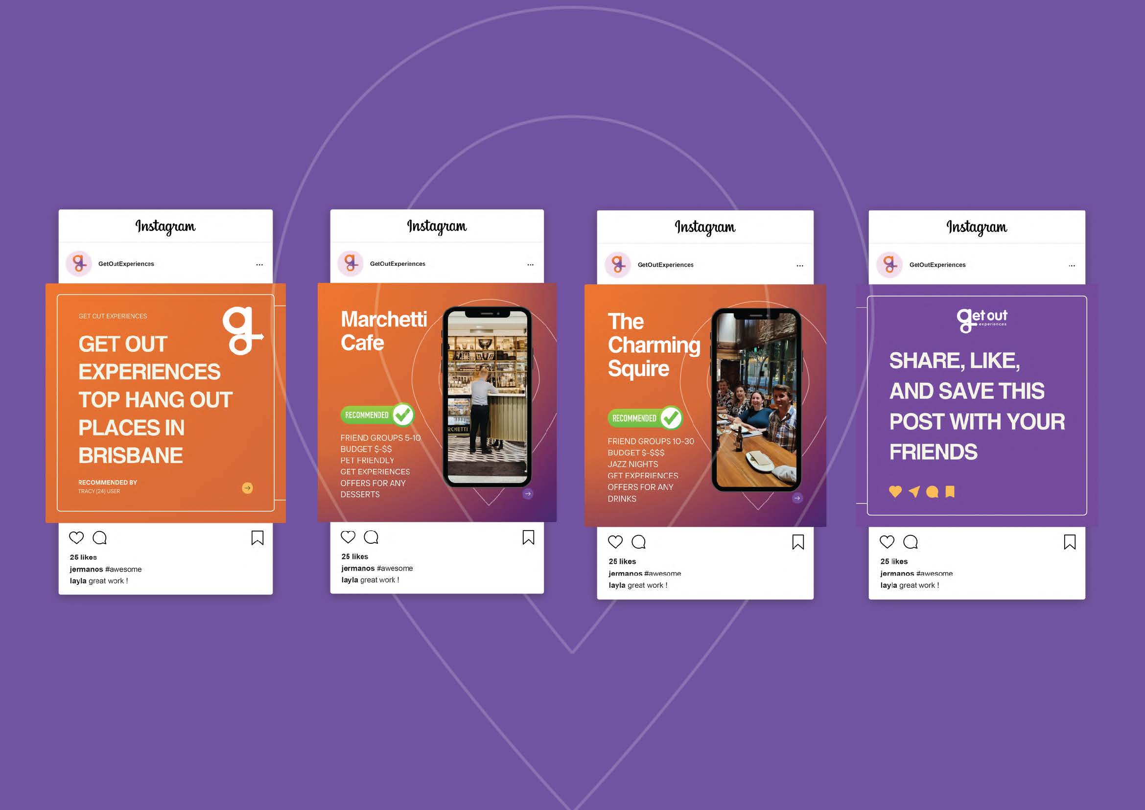
Social Media.
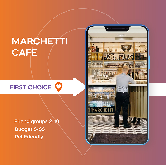
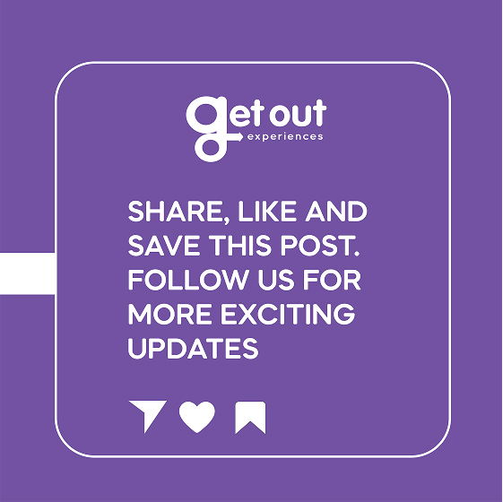
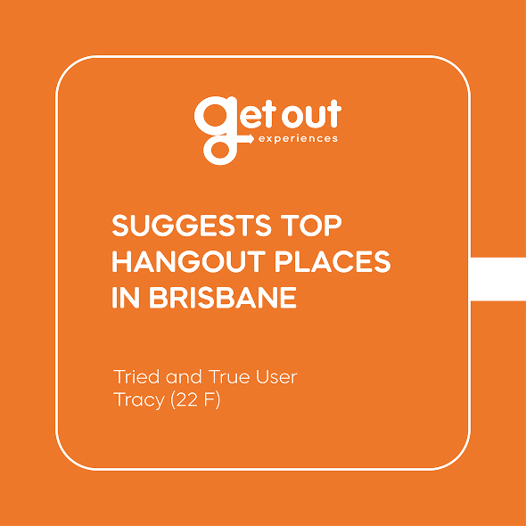
We helped Get Out Experiences (GOE) build a standout social presence with strategic content and a consistent visual approach. We created a full suite of branded social templates, designed to be flexible, eye-catching, and easy to use across Instagram, Facebook, LinkedIn, and more. Each one keeps the look aligned while leaving room for playful, engaging content.
To support this, we developed a detailed social media plan focused on:
Sharing the brand story through moment-led content
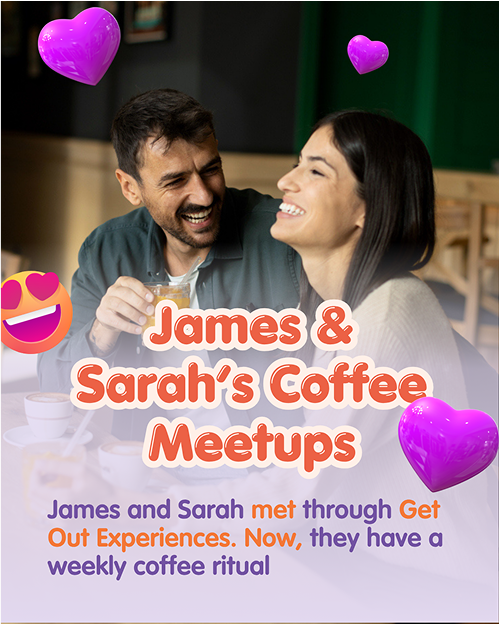
Highlighting app features in real-world use
Driving engagement through user-generated posts
Supporting key launches and campaign bursts
Every post was designed to reflect GOE’s voice, values, and energy, because the small details build the bigger picture.


Ready For Launch
At Ideas, we helped Get Out Experiences (GOE) stand out in the Australian market by combining strategic content with clear, consistent storytelling. Every touchpoint—from social posts to app copy—was crafted to build recognition, spark interest, and grow a loyal audience.


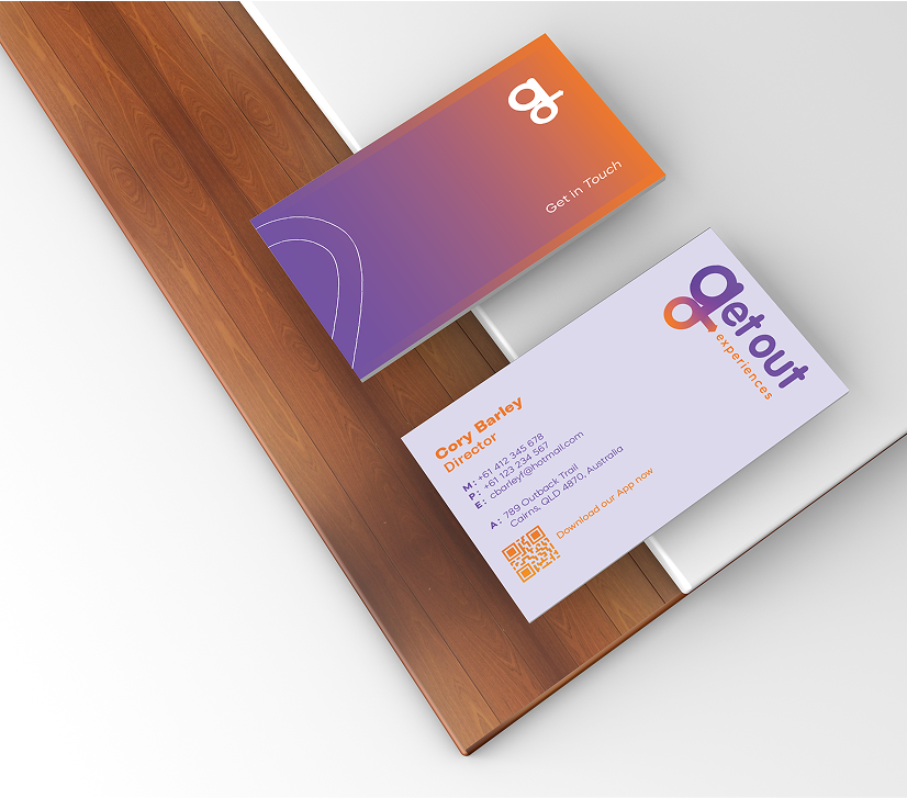
Business Card.
We designed a clean, high-impact business card that reflects GOE’s brand personality. Printed on quality stock with sharp, consistent visuals, it delivers a strong first impression—bringing the digital brand into the real world with confidence and clarity.
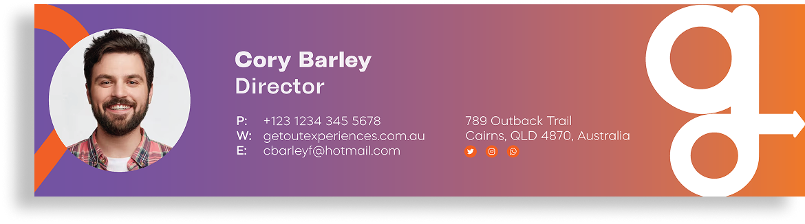
Email signature.
We created a sleek, branded email signature that keeps GOE’s identity front and centre in every interaction. Designed for clarity and impact, it reinforces the brand with every send—building recognition and leaving a polished, consistent impression in every inbox.
Brand Guidance
Brand Guidelines designed for clear visibility and strong brand recognition. From office signage to event banners, each element reflects professionalism, ensuring a lasting impression in both physical and digital spaces.


Elevating Market Influence.
At Ideas, we helped Get Out Experiences (GOE) grow its presence in Australia’s social and lifestyle space by delivering content that informs, entertains, and connects. From podcast features to interactive webinars and blog articles, we built a content strategy that positioned GOE as more than just an app—it became a trusted voice in the space.
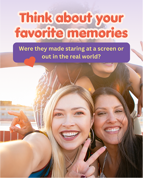
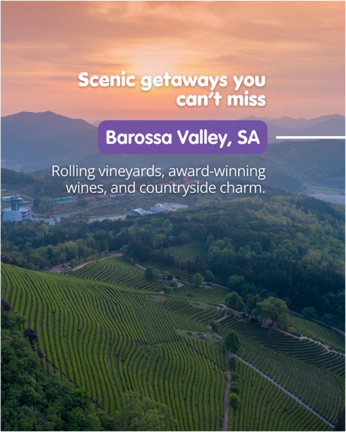
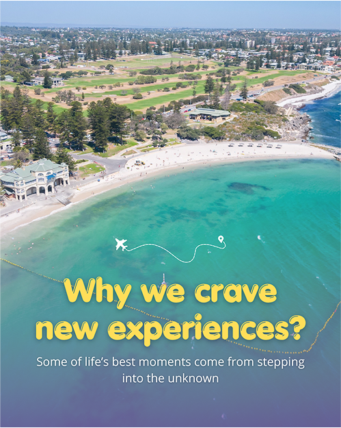
We developed a series of data-led blog articles tailored to GOE’s audience—covering topics like social planning trends, user behaviour, and lifestyle insights. Each piece was designed to offer real value, drive organic traffic, and strengthen the brand’s SEO—helping GOE show up where its audience was already searching.
related projects.
Explore more of our work where strategy, design, and execution came together to build strong brands, drive growth, and deliver real impact.
Each project shows how we help businesses stand out—and stay ahead.