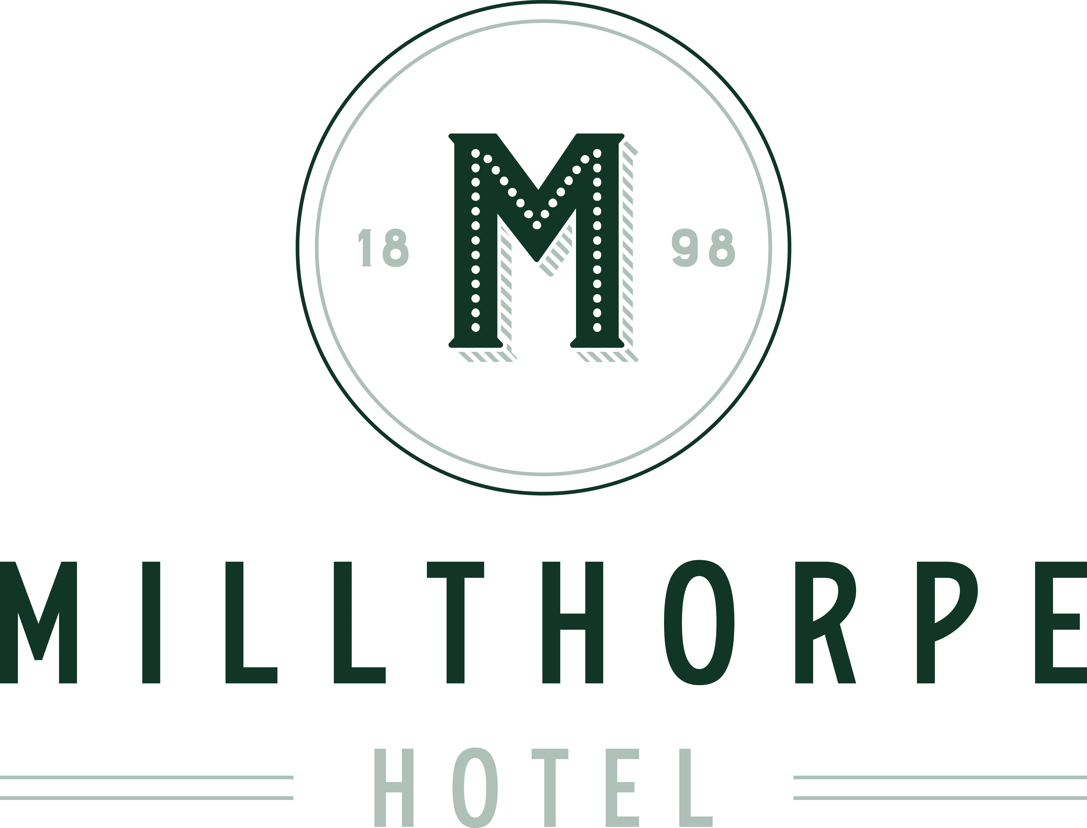
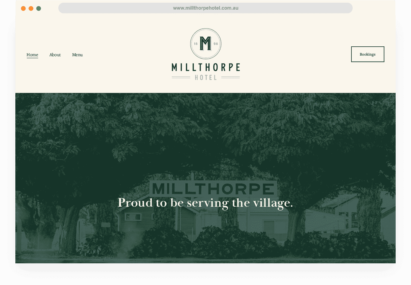
M e n u t o p

Connect With Us


    Project Overview

    Millthorpe Hotel
    Tradition meets timeless.

    Goal Previously known as ‘The Railway Hotel’ with strong roots in town, we were tasked to create a fresh identity that paid homage to the traditional, whilst laying strong brand foundations for the development of the venue. A clean, refined and versatile brand was created. Familiarities of regional pubs still echo within the logo, whilst providing a longevity and freshness through complementing colours and applications.

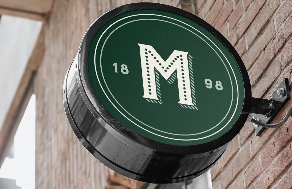
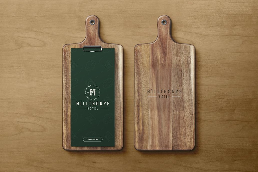
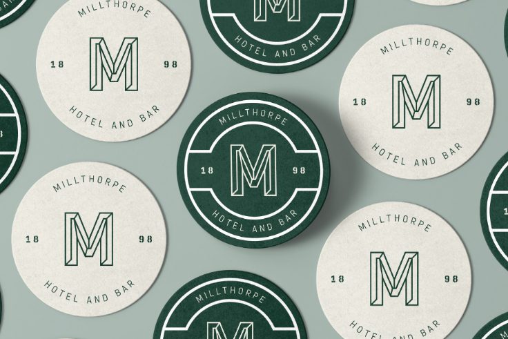
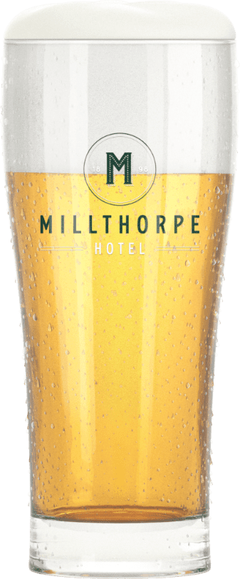
    Answer Ideas provided a new elevated colour pallet of forest green with contrasting soft cream to provide a distinguished look & feel, reminiscent of the countryside. We matched the logo with an ownable wordmark symbolised with the letter "m" that can be utilised in various applications within the venue. We designed menus, coasters, tap heads, signage, business cards, menu boards, cutlery and napkin holders. All these elements provide a considered branded journey for its patrons.

    What We Did * Brand Identity
    * Brand Strategy
    * Website Design
    * Digital Marketing
    * Content Creation
    * Website UI and UX
    * Hospitality Designs

    First round is on us.

    From 1898 the taps were turning for this famous country pub. The Ideas team were part of the rebranding strategy for this timeless, heritage-listed establishment which started as the Family Hotel opened by Jason Blackmore. Fast-forward to today, we wanted to pay respect to the village it serves and the Milthorpe Hotel was born! The name may have changed but the country pub you know and love will continue to be a legacy in the township of Milthorpe.

    C
    REA .

    See how we transformed an iconic country pub.

    Millthorpe is a historic village set amidst gently rolling hills, with two historic pubs, surviving from four that had traded at the height of the town’s prosperity in the early 1900s. The village is classified by the National Trust and, because it’s not on a main thoroughfare, has managed to avoid overdevelopment. Millthorpe has retained a 19th century charm, and, with its craft stores, cafes, and quirky shops, is well worth a weekend drive.

    We crafted a new elevated typography, logomark complemented by a distinctive colour palette of forest green and soft cream that are iconic colours reminiscent of the countryside.

    “Ideas did an absolutely brilliant job on another project that we knew they were the perfect team for this project. We love the way the guys brought our Parrot brand to life so it was a no brainer to work with them again” - Ben Cochrane

    Make yourself at home.

    We designed the website to complement the in house experience and feel. We kept the user experience front and centre, with simple menu navigation to make reservations, book accomodation and plan ahead with access to the seasonal ordering menu.

    Visit Website

    Enjoy the hospitality.

    Hospitality branding done right. Coasters, napkin holders, cutlery holders, menu design, menu holders. Coming right up!

    We created a uniformed hospitality set to ensure all touchpoints were considered with the new hero branding, inclusive of the "m" brandmark to be a feature in the contrasting colours across all printed parts for consistency.

    Un lien très fort

    The Company We Keep Our clients are leaders in their chosen fields. We are proud partners of their ongoing success.

    Let's Connect.

    If you’d like to find out more, please complete the form below and we’ll get back to you soon.

    Want to work with us?
    Our team are ready to bring your vision to life.

    This site is not available in landscape mode,
    Please turn your mobile.

    En soumettant ce formulaire, j’accepte que l’adresse mail saisie soit exploitée par Wokine, uniquement dans le cadre de mon inscription à la newsletter.
    Pour connaître et exercer vos droits, notamment de retrait de votre consentement à l’utilisation des données collectées, veuillez consulter notre politique de confidentialité